도형과 상자를 다루는 것은 설계된 UI를 구현하는 방법을 알지 못하면 압도될 수 있습니다. 이 기사에서는 매우 기초부터 시작하여 일부 고급 예제로 이동할 것입니다.
1. 도형과 상자란 무엇인가요?
도형은 해당 경로에 의해 정의된 어떤 형태를 나타낼 수 있습니다.
상자는 4개의 점으로 구성된 직사각형 모양을 나타냅니다. 테두리 반경과 같은 추가 속성을 가질 수 있습니다.
위젯 Flutter의 다양한 컨텍스트에서 상자가 나타날 수 있어요.
예를 들어:
- RenderBox: 비 슬리버 컨텍스트의 위젯의 RenderObject
- BoxDecoration
- BoxBorder
또한 ShapeDecoration, ShapeBorder와 같은 클래스들도 있어요.
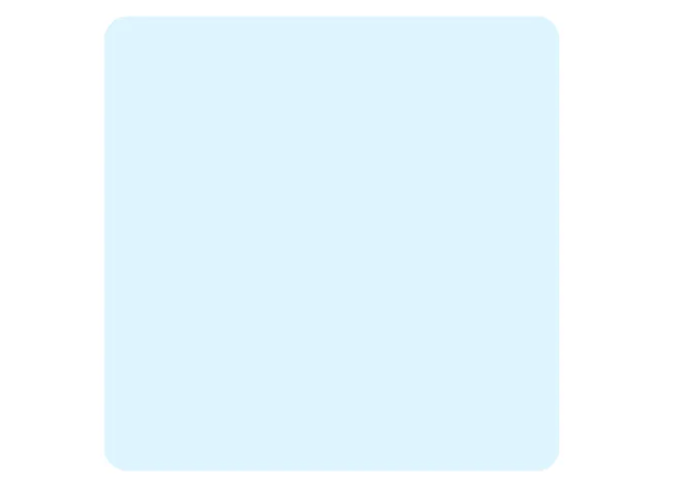
우리는 Container, DecoratedSlivers 또는 DecoratedBoxes를 스타일링하기 위해 자주 BoxDecoration을 사용해요:
DecoratedBox(
  decoration: BoxDecoration( // <- this
    borderRadius: BorderRadius.circular(10),
    color: Colors.amber,
  ),
  child: const SizedBox(height: 200, width: 200),
)
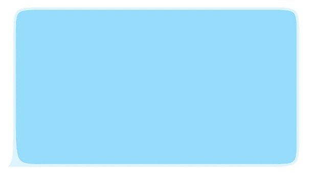
그냥 이렇게 해서, 결과를 얻습니다:
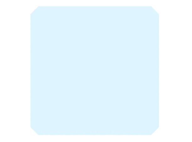
대안으로 ShapeDecoration을 사용할 수도 있는데, 이것은 색상, 그림자, 그라디언트의 비슷한 사용자 정의를 제공하지만 주요 차이점은 그 모양 매개변수가 BoxShape 대신 ShapeBorder를 사용한다는 것입니다.
DecoratedBox(
  decoration: ShapeDecoration( // <- 이 부분
    color: Colors.amber,
    shape: BeveledRectangleBorder(borderRadius: BorderRadius.circular(20)),
  ),
  child: const SizedBox(height: 200, width: 200),
)
그럼 ShapeBorder는 정확히 무엇인가요?
구현을 확인하면 좀 더 명확해집니다. OutlinedBorder, StarBorder, BeveledRectangleBorder와 같은 슈퍼클래스들이 있습니다. 이것들은 위젯을 꾸미기 위한 다양한 모양들입니다. 그리고 WidgetStateOutlinedBorder도 있습니다. WidgetStates에 익숙하지 않다면 해당 기사를 읽어보세요.
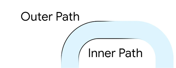
경계의 본질은 내부 경로와 외부 경로 2개가 있어야 한다는 것을 의미합니다:
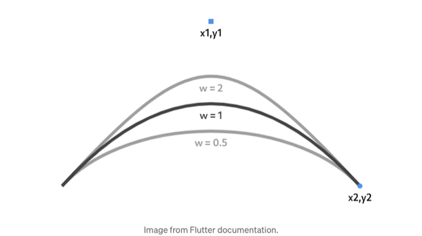
베지에 곡선에 익숙하지 않다면, 이 대화식 가이드를 확인하는 것을 추천합니다. 플러터의 Path는 선형, 이차, 삼차 및 콘회의 절을 지원합니다.
용어는 여기까지, 이제 재미있는 일을 시작해 봅시다: 사용자 정의 모양을 만들어 보세요!
2. 사용자 정의 ShapeBorder 구현
위 작업을 수행하려면 ShapeBorder의 슈퍼 클래스 또는 OutlinedBorder를 만들고 다음 메서드를 구현해야 합니다:
- getInnerPath 및 getOuterPath: 해당 경로를 반환하는 메서드
- paint: 모양을 그리는 메서드
- scale, copyWith
원하는 메시지 버블 모양을 만들어보겠습니다. 원구획을 사용하고 두께(w) 매개변수를 변수로 사용하세요.
class MessageShapeBorder extends OutlinedBorder {
  final double borderRadius;
  final double weight;

  const MessageShapeBorder({
    super.side,
    this.borderRadius = 50,
    this.weight = 2.5,
  });

  ...

}
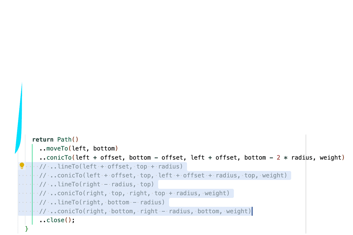
그 다음으로, getOuterPath 메서드를 구현합니다. 여기서 경로는 아래 왼쪽 모서리에서 시계 방향으로 이동하는 선 및 물결 모양 세그먼트로 구성됩니다.
  @override
  Path getOuterPath(Rect rect, {TextDirection? textDirection}) {
    final double left = rect.left;
    final double right = rect.right;
    final double top = rect.top;
    final double bottom = rect.bottom;

    final radius = borderRadius;
    final offset = 10;

    return Path()
      ..moveTo(left, bottom)
      ..conicTo(left + offset, bottom - offset, left + offset,
          bottom - 2 * radius, weight)
      ..lineTo(left + offset, top + radius)
      ..conicTo(left + offset, top, left + offset + radius, top, weight)
      ..lineTo(right - radius, top)
      ..conicTo(right, top, right, top + radius, weight)
      ..lineTo(right, bottom - radius)
      ..conicTo(right, bottom, right - radius, bottom, weight)
      ..close();
  }
더 명확하게 하기 위해, 아래는 각 행이 하는 작업을 시각적으로 보여줍니다:
이제 약간 다른 내부 경로를 만들어 봅시다:
  @override
  Path getInnerPath(Rect rect, {TextDirection? textDirection}) {
    final strokeWidth = side.width;

    final double left = rect.left + strokeWidth;
    final double right = rect.right - strokeWidth;
    final double top = rect.top + strokeWidth;
    final double bottom = rect.bottom - strokeWidth;

    final radius = math.max(0, borderRadius - 10);
    final offset = 10;

    return Path()
      ..moveTo(left + offset + radius, bottom)
      ..conicTo(
          left + offset, bottom, left + offset, bottom - 2 * radius, weight)
      ..lineTo(left + offset, top + radius)
      ..conicTo(left + offset, top, left + offset + radius, top, weight)
      ..lineTo(right - radius, top)
      ..conicTo(right, top, right, top + radius, weight)
      ..lineTo(right, bottom - radius)
      ..conicTo(right, bottom, right - radius, bottom, weight)
      ..close();
  }
  @override
  void paint(Canvas canvas, Rect rect, {TextDirection? textDirection}) {
    canvas.drawPath(getInnerPath(rect), Paint()..color = side.color);
  }
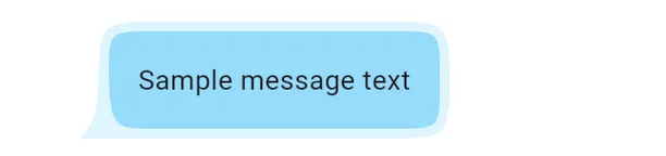
이제 이 모양을 다음과 같이 DecoratedBox에서 사용할 수 있습니다:
DecoratedBox(
  decoration: ShapeDecoration(
    shape: MessageShapeBorder(
      borderRadius: 30,
      fillColor: Color(0xFF7ADEFF)
    ),
    color: Color(0xFFd6f5ff),
  ),
  child: Padding(
    padding: EdgeInsets.all(20).copyWith(left: 30),
    child: Text("샘플 메시지 텍스트"),
  ),
)
안녕하세요! 코닉 섹션의 무게를 AnimatedBuilder를 사용하여 애니메이션할 수 있습니다. 만약 플러터의 애니메이션에 익숙하지 않다면, 꼭 공식 안내서를 읽어보시기를 강력히 추천합니다.
MessageShapeBorder(
  side: BorderSide(color: Color(0xFF7ADEFF), width: animation.value + 2),
  weight: animation.value,
  borderRadius: 30
)

3. 사용 중인 클리퍼
Flutter에서는 여러 내장 클리퍼가 있습니다. 예를 들면:
- 직사각형에 사용하는 ClipRect
- 둥근 직사각형에 사용하는 ClipRRect
- 원과 타원에 사용하는 ClipOval
- 사용자 정의 경로에 사용하는 ClipPath
첫 세 개는 사용하기 매우 간단합니다. 클리핑을 원하는 위젯을 해당 클리퍼로 감싸기만 하면 클리핑 효과를 얻을 수 있습니다. 그러나 이러한 클래스들에 대해 더 알고 싶다면 여기 공식 문서 링크를 참조해주세요.
ClipPath은 CustomClipper를 인수로 사용합니다. 대부분의 경우에는 ShapeBorder를 ShapeBorderClipper에 전달하면 됩니다. 이는 ShapeBorder의 외부 경로로 자식을 클리핑하는 CustomClipper의 구현입니다:
ClipPath(
clipper: const ShapeBorderClipper( // <- 이 부분
shape: MessageShapeBorder(),
),
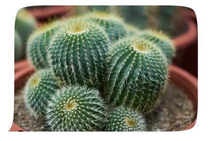
child: Image.asset(
"assets/6392956.jpg",
height: 300,
width: 300,
fit: BoxFit.cover,
cacheHeight: (300 * MediaQuery.of(context).devicePixelRatio).toInt(),
),
);
클리핑이 레이아웃에서 사용될 때마다 새 레이어가 생성되는 점을 주의해야 합니다. 이는 비교적 비용이 많이 드는 작업이므로 가능한 경우 클리핑 대신 데코레이션을 사용하세요.
4. 사용자 지정 클리퍼
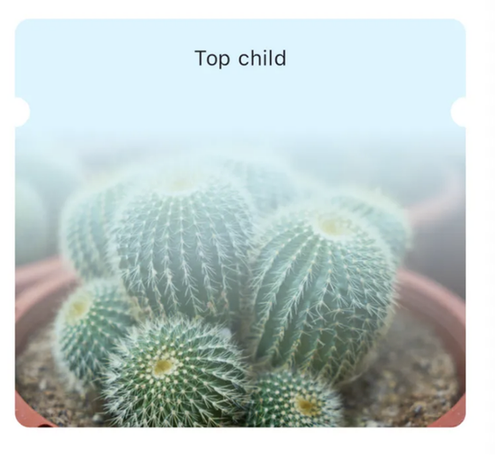
일부 경우에는 클리핑에 대해 더 많은 제어가 필요합니다. 예를 들어, 클리핑이 콘텐츠나 일부 형제 위젯에 따라 달라져야 할 때입니다. 콘텐츠에 따라 달라지는 노치가 있는 티켓 모양 위젯을 만들어 봅시다:
여기서 어려운 점은 상하 자식 위젯의 크기가 다를 수 있고, 노치가 이에 종속되어야 한다는 것입니다. Flutter에서 위젯의 크기 정보는 RenderObject의 하위 클래스인 RenderBox를 사용하여 얻을 수 있습니다. RenderObjects에 익숙하지 않다면, 공식 문서로 이동하여 확인해보세요.
먼저 레이아웃을 만들고 상단과 하단 자식을 나누는 SizedBox에 GlobalKey를 추가해보겠습니다.
final notchKey = GlobalKey(); // <- 이 부분

...

Column(
  children: [
    widget.topChild,
    SizedBox(key: notchKey, height: 20), // <- 이 부분
    widget.bottomChild,
  ],
)
GlobalKey를 사용하면 위젯의 BuildContext를 얻을 수 있어요. RenderObject를 얻기 위해 context가 필요한데요. SizedBox의 좌표를 티켓 위젯의 context에서 가져와야 해서 해당 RenderBoxes가 필요해요. 여기에서는 Slivers을 사용하지 않기 때문에 RenderObject를 안전하게 RenderBox로 형변환할 수 있어요.
ClipPath(
  clipper: _TicketClipper( // <- 우리의 클리퍼
    notchBox: notchKey.currentContext?.findRenderObject() as RenderBox, // <- 이 부분
    ancestorBox: context.findRenderObject() as RenderBox, // <- 이 부분
  ),
  child: ColoredBox(
    color: Color(0xFFd6f5ff),
    child: Column(
      children: ...
    ),
  ),
)
그리고 클리퍼 자체는 다음과 같이 보일 것입니다:
class _TicketClipper extends CustomClipper<Path> {
  final RenderBox notchBox;
  final RenderBox ancestorBox;

  _TicketClipper({required this.notchBox, required this.ancestorBox});

  @override
  Path getClip(Size size) {
    final widgetRect = RRect.fromRectAndRadius(
      Rect.fromPoints(Offset.zero, Offset(size.width, size.height)),
      const Radius.circular(10),
    );

    final notch = notchBox.localToGlobal(Offset.zero, ancestor: ancestorBox);

    return Path.combine(
      PathOperation.difference,
      Path()..addRRect(widgetRect),
      Path()
        ..addOval(Rect.fromCenter(
            center: Offset(0, notch.dy + 10), width: 20, height: 20))
        ..addOval(Rect.fromCenter(
            center: Offset(size.width, notch.dy + 10), width: 20, height: 20)),
    );
  }

  @override
  bool shouldReclip(covariant CustomClipper<Path> oldClipper) {
    ...
  }
}
Flutter는 차이, 교차 등의 경로 작업을 지원합니다. 여기서는 둥근 사각형에서 2개의 원을 빼내어 원하는 모양을 얻어낸 것입니다.
이 글이 도움이 되셨기를 바랍니다. 새로운 기술을 발견할 때마다 업데이트하겠습니다. 최신 업데이트를 받으시려면 Twitter에서 제 소식을 팔로우해주세요. 전체 코드를 읽고 싶다면 저장소를 확인해주세요.