현재 작업 중인 프로젝트에서 — 곧 공유할 예정이에요, BottomNavigationBar를 포함해야 했어요. 하지만 단순한 하단 네비게이션 바가 아니라, 약간은 멋지고 세련된 모습으로 구현하고 싶었어요.
BottomNavigationBar는 하단에 작은 위젯들(아이콘 또는 레이블)을 나란히 표시할 수 있는 위젯이에요. 이를 통해 한 번에 하나의 항목을 선택하고 해당 페이지/UI로 빠르게 이동할 수 있어요. 하단 네비게이션 바에는 2~5개의 항목을 넣는 것이 권장되고요. 그 이상의 경우에는 네비게이션 드로어나 탭을 사용하는 것이 더 좋아요.
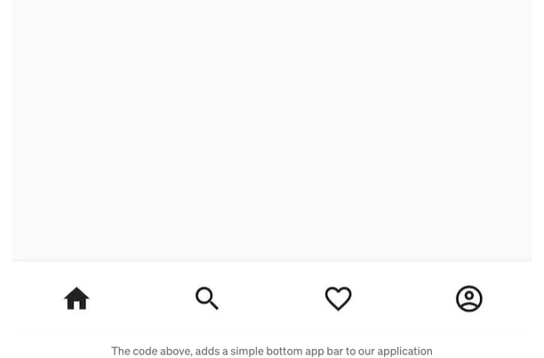
구현 Flutter에서 하단 네비게이션 바를 사용하려면 build 메서드가 Scaffold 위젯을 반환해야 해요.
class _MyHomePageState extends State<MyHomePage> {

  @override
  Widget build(BuildContext context) {
    return Scaffold(
      appBar: AppBar(
        title: const Text('Bottom Navigation Bar'),
        centerTitle: true,
      ),
      body: const Center(),
    );
  }
}
Scaffold 위젯에는 bottomNavigationBar 속성이 있으며, 이를 통해 BottomAppBar 위젯을 추가할 수 있습니다. 나는 내 탐색 바에 '노치'를 추가하고 싶었기 때문에 BottomAppBar를 사용하고 있습니다 — 그래서 "조금 멋지고 멋있어 보이게"하고 있는 것이죠.
BottomAppBar에는 다음과 같은 속성들을 사용하고 싶었어요:
- shape — 탐색 바에 노치를 추가하여 겹치는 FAB(Floating Action Button)에 공간을 만듦
- notchMargin — 탐색 바 노치와 FAB 사이의 여백
- clipBehavior — 설정 옵션에 따라 내용이 클리핑되는지 여부를 지정합니다
bottomNavigationBar: BottomAppBar(
  shape: const CircularNotchedRectangle(),
  notchMargin: 5.0,
  clipBehavior: Clip.antiAlias,
  child: SizedBox(
    height: kBottomNavigationBarHeight,
    child: Row(
      mainAxisSize: MainAxisSize.max,
      mainAxisAlignment: MainAxisAlignment.spaceAround,
      children: <Widget>[
        IconButton(
          icon: const Icon(Icons.home),
          onPressed: () {
            setState(() {
            });
          },
        ),
        IconButton(
          icon: const Icon(Icons.search),
          onPressed: () {
            setState(() {
            });
          },
        ),
        IconButton(
          icon: const Icon(Icons.favorite_border_outlined),
          onPressed: () {
            setState(() {
            });
          },
        ),
        IconButton(
          icon: const Icon(Icons.account_circle_outlined),
          onPressed: () {
            setState(() {
            });
          },
        )
      ],
    ),
  ),
),
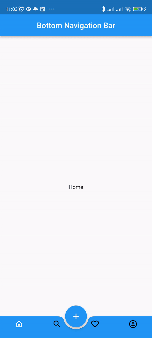
이제 BottomAppBar 속성을 사용하기 위해 FAB를 추가할 때 centerDocked 속성을 사용해야 합니다.
floatingActionButtonLocation: FloatingActionButtonLocation.centerDocked,
floatingActionButton: FloatingActionButton(
  onPressed: () {},
  child: const Icon(Icons.add),
),
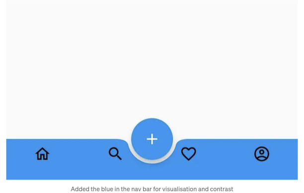
그래서 우리는 이제 '다른' 디자인의 하단 네비게이션 바를 얻을 수 있게 되었습니다.
그러나 구현이 간단해 보이더라도, 실제로 작동하게 만드는 데 꽤 고생했습니다. 먼저 BottomAppBar에는 currentIndex 속성이 없어서 어떤 아이콘이 선택되었는지 알아야 페이지를 이동할 수 없습니다. 또한 selectedItemColor와 unselectedItemColor 속성도 없어서 해당 화면으로 이동될 때 아이콘 색상을 전환할 수 없습니다.
그래서 BottomAppBar의 자식으로 BottomNavigationBar를 사용해야 합니다. 또한 페이지 간 전환을 허용하기 위해 pageController를 사용할 것입니다.
bottomNavigationBar: BottomAppBar(
  shape: const CircularNotchedRectangle(),
  notchMargin: 5.0,
  clipBehavior: Clip.antiAlias,
  child: SizedBox(
    height: kBottomNavigationBarHeight,
    child: BottomNavigationBar(
      type: BottomNavigationBarType.fixed,
      backgroundColor: Colors.green,
      currentIndex: _selectedIndex,
      selectedItemColor: Colors.white,
      unselectedItemColor: Colors.black,
      onTap: (index) {
        setState(() {
          _selectedIndex = index;
          pageController.jumpToPage(index);
        });
      },
      items: const [
        BottomNavigationBarItem(
          icon: Icon(Icons.home_outlined),
          label: '',
        ),
        BottomNavigationBarItem(
          icon: Icon(Icons.search),
          label: '',
        ),
        BottomNavigationBarItem(
          icon: Icon(Icons.favorite_border_outlined),
          label: '',
        ),
        BottomNavigationBarItem(
          icon: Icon(Icons.account_circle_outlined),
          label: '',
        ),
      ],
    ),
  ),
),
body: PageView(
  controller: pageController,
  children: const <Widget>[
    Center(
      child: Home(),
    ),
    Center(
      child: Search(),
    ),
    Center(
      child: Favourite(),
    ),
    Center(
      child: Profile(),
    ),
  ],
),
Let me know how I can improve on this implementation (e.g., the spacing of the icons next to the notch could be better when there are four navigation items. It looks okay when it’s just two items.)
읽어 주셔서 감사합니다 ❤