
안녕하세요 독자 여러분, 이 기사에서는 플러터 앱에 확장 가능한 목록 타일을 추가하는 방법에 대해 알아보겠습니다. 이것은 우리가 목록 뷰에서 목록 타일을 사용하는 방식과 유사합니다. 따라서 시작하기 전에 오늘 어떤 것을 달성하고 싶은지 먼저 살펴보겠습니다.
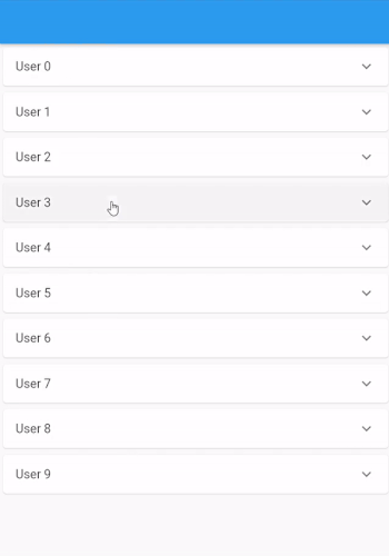
확장 타일이란 무엇인가요?
플러터에서의 확장 타일은 이미 리스트 뷰에서 사용해본 ListTile과 거의 비슷하지만, 유일한 차이점은 사용자가 타일을 확장하거나 축소하여 타일에 대한 자세한 정보를 볼 수 있다는 것입니다. 위 이미지에서 확장 타일의 예시를 볼 수 있어요.
확장 타일은 주로 ListTile에 몇 가지 추가 정보를 추가하고 싶지만, 그 정보가 처음에는 필요하지 않을 때 사용됩니다. 사용자가 보고 싶을 때 볼 수 있어요.
ListView 만들기
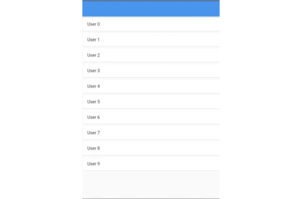
확장 리스트 뷰를 만들기 전에 기본 리스트 뷰와 리스트 타일만 있는 리스트 뷰를 만들어 볼게요. 이를 위해, 그냥 단순히 ListView.builder()를 scaffold의 body에 추가하면 돼요.
class HomeScreen extends StatelessWidget {
  const HomeScreen({Key? key}) : super(key: key);

  @override
  Widget build(BuildContext context) {
    return Scaffold(
        appBar: AppBar(
          title: const Text(""),
        ),
        body: ListView.builder(
          itemCount: 10,
          itemBuilder: (context, index) {
            return Card(
              child: ListTile(
                title: Text("사용자 $index"),
              ),
            );
          },
        ));
  }
}
이제 리스트 뷰는 다음과 같이 보일 것입니다.
ListView에 ExpansionTile 추가하기
기본 목록 보기가 준비되었습니다. 목록의 항목을 확장 가능하게 만들려면 ListTile 위젯을 ExpansionTile로 변경하면 됩니다.
body: ListView.builder(
    itemCount: 10,
    itemBuilder: (context, index) {
      return Card(
        child: ExpansionTile(
          title: Text("User $index"),
        ),
      );
    },
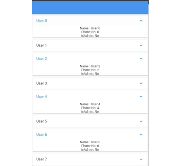
ExpansionTile로 ListTile을 변경한 후에는 타일 끝에 화살표가 있는 것을 볼 수 있습니다. 이제 타일을 클릭하면 타일이 확장되고 강조 표시되며 화살표 방향이 바뀝니다.

하지만 타일이 확장되면 아무것도 보이지 않습니다. 이는 ExpansionTile에서 children 매개변수를 제공해야하기 때문입니다. 우리가 children으로 전달하는 어떤 위젯이든, 타일을 확장할 때 표시됩니다.
 return Card(
  child: ExpansionTile(
    title: Text("User $index"),
    children: [
      Text("Name : User $index"),
      Text("Phone No: $index"),
      const Text("isAdmin: No")
    ],
  ),
);
이제 우리의 목표가 달성되었습니다. 확장 가능한 자식을 가진 리스트 뷰입니다. 그러나 확장된 타일이 멋지지 않습니다. 그렇기 때문에 ExpansionTile 생성자에는 타일을 더 매력적으로 만들기 위해 사용할 수 있는 다른 매개변수들이 몇 가지 있습니다. 한 번 살펴보겠습니다.
ExpansionTile 위젯의 매개변수
생성자
 ExpansionTile({
  Key? key,
  Widget? leading,
  required Widget title,
  Widget? subtitle,
  void Function(bool)? onExpansionChanged,
  List<Widget> children = const <Widget>[],
  Widget? trailing,
  bool initiallyExpanded = false,
  bool maintainState = false,
  EdgeInsetsGeometry? tilePadding,
  CrossAxisAlignment? expandedCrossAxisAlignment,
  Alignment? expandedAlignment,
  EdgeInsetsGeometry? childrenPadding,
  Color? backgroundColor,
  Color? collapsedBackgroundColor,
  Color? textColor,
  Color? collapsedTextColor,
  Color? iconColor,
  Color? collapsedIconColor,
  ShapeBorder? shape,
  ShapeBorder? collapsedShape,
  Clip? clipBehavior,
  ListTileControlAffinity? controlAffinity,
})
위는 ExpansionTile 위젯의 생성자이며 대부분의 매개변수는 ListTile과 유사하지만 ExpansionTile에서 새로운 매개변수가 있습니다.
onExpansionChanged 사용자가 타일을 클릭할 때 호출되는 함수입니다. 이 함수에는 Boolean isExpanded 매개변수가 전달됩니다. 사용자가 타일을 확장했다면 값은 true가 되고, 사용자가 타일을 축소했다면 값은 false가 됩니다.
onExpansionChanged: (value) {
  ScaffoldMessenger.of(context).showSnackBar(SnackBar(
      content: Text(
        "$index 타일 ${value ? "확장됨" : "축소됨"}")));
},

initiallyExpanded 위젯의 첫 번째 빌드 시에 타일을 기본적으로 확장하는 경우 true를 전달하는 부울 변수입니다.
ExpansionTile(
  title: Text("사용자 $index"),
  initiallyExpanded: index.isEven, // 모든 짝수 타일이 기본적으로 확장됨
  children: [
    Text("이름: 사용자 $index"),
    Text("전화번호: $index"),
    const Text("isAdmin: 아니요")
  ],
),
maintainState 타일이 확장되고 축소될 때 체일드의 상태를 유지할지 여부를 지정합니다.
true인 경우 타일이 축소될 때도 체일드는 트리에 유지됩니다. false인 경우 (기본값) 타일이 축소될 때 체일드가 트리에서 제거되고 확장 시에 다시 생성됩니다.
expandedCrossAxisAlignment 타일이 확장될 때 각 자식의 정렬을 지정합니다.
확장된 타일의 내부에서는 [children]을 위해 [Column] 위젯을 사용하며, crossAxisAlignment 매개변수는 [Column]으로 직접 전달됩니다.
return Card(
  child: ExpansionTile(
    title: Text("User $index"),
    maintainState: true,
    expandedCrossAxisAlignment: CrossAxisAlignment.end,
    children: [
      Row(
        children: const [Text("This is a Row")],
      ),
      Text("Name: User $index"),
      Text("Phone No: $index"),
      const Text("isAdmin: No")
    ],
  ),
);
expandedAlignment 이 속성은 확장된 타일 내부의 자식 요소를 정렬합니다.
ExpansionTile(
                title: Text("User $index"),
                maintainState: true,
                expandedAlignment: Alignment.centerLeft,
                children: [
                  Text("Name : User $index"),
                  Text("Phone No: $index"),
                  const Text("isAdmin: No")
                ],
              ),
childrenPadding 이름에서 알 수 있듯이 확장된 위젯 내 자식 요소 주위의 여백입니다.
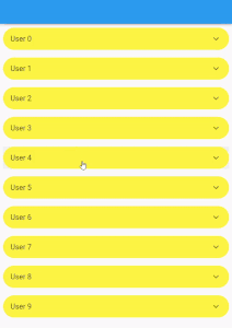
backgroundColor 및 collapsedBackgroundColor 이것은 타일이 축소되거나 확장되었을 때 적용되는 배경색입니다.
return Card(
              child: ExpansionTile(
                title: Text("사용자 $index"),
                maintainState: true,
                backgroundColor: Colors.red,
                collapsedBackgroundColor: Colors.yellow,
                children: [
                  Text("이름: 사용자 $index"),
                  Text("전화번호: $index"),
                  const Text("관리자 권한: 아니요")
                ],
              ),
            );

textColor, collapsedTextColor, iconColor, collapsedIconColor 이것은 타일이 확장되었거나 축소될 때 텍스트와 아이콘의 색상입니다.
return Card(
              child: ExpansionTile(
                title: Text("사용자 $index"),
                maintainState: true,
                textColor: Colors.red,
                collapsedTextColor: Colors.yellow,
                iconColor: Colors.red,
                collapsedIconColor: Colors.yellow,
                children: [
                  Text("이름: 사용자 $index"),
                  Text("전화번호: $index"),
                  const Text("관리자 권한: 아니요")
                ],
              ),
            );
shape 및 collapsedShape 이 매개변수를 사용하여 타일이 축소 또는 확장될 때 모양을 변경할 수 있습니다.
return Padding(
              padding: const EdgeInsets.all(8.0),
              child: ExpansionTile(
                title: Text("User $index"),
                maintainState: true,
                backgroundColor: Colors.red,
                collapsedBackgroundColor: Colors.yellow,
                shape: const RoundedRectangleBorder(
                    borderRadius: BorderRadius.all(Radius.circular(20))),
                collapsedShape: const RoundedRectangleBorder(
                    borderRadius: BorderRadius.all(Radius.circular(50))),
                children: [
                  Text("이름: User $index"),
                  Text("전화번호: $index"),
                  const Text("관리자: 아니요")
                ],
              ),
            );
controlAffinity 일반적으로 확장 화살표 아이콘을 타일의 선행 또는 후행 가장자리에 강제로 배치하는 데 사용됩니다.
기본적으로 [controlAffinity]의 값은 [ListTileControlAffinity.platform]이며, 이는 확장 화살표 아이콘이 타일의 뒷부분에 표시된다는 것을 의미합니다.
결론
요약하면, ExpansionTile 위젯은 Flutter 앱에서 확장 가능하고 접을 수 있는 콘텐츠를 생성하는 데 유용한 도구입니다. 몇 줄의 코드로 깔끔한 사용자 인터페이스를 만들어 사용자들이 쉽게 더 많은 정보에 액세스할 수 있도록 할 수 있습니다.
이 기사가 ExpansionTile 위젯에 대한 유용한 소개를 제공하고 여러분이 자신의 Flutter 개발 프로젝트에 이를 통합하도록 영감을 주었기를 바랍니다.
함께해요
이 글을 읽어 주셔서 감사합니다. 만약 마음에 드셨다면 더 많은 글을 읽어보고 저를 팔로우해주세요.