플러터를 위한 간단한 레이아웃 샘플이 필요하신가요? 제가 마련한 플러터 레이아웃 코드 조각을 소개합니다. 시각적 예시를 풍부하고 간결하게 제시할 거에요. 아직은 작업 중이라 샘플 목록은 계속 늘어날 거예요. 플러터 위젯의 활용에 더 초점을 맞출 거라 구성요소를 보여주는 것보다는 (플러터 갤러리가 그런 부분에 뛰어나거든요!) 플러터 레이아웃에 문제가 있거나 다른 사람들과 코드 조각을 공유하고 싶다면 말씀해주세요!
이 기사는 다음 언어로도 제공됩니다:
- Eddy에 의해 포르투갈어
애니메이션에 관한 유사한 기사가 궁금하시다면, Flutter Animations Cheat Sheet를 확인해보세요.
목차
- 행 및 열
- 내재 너비 및 내재 높이
- 쌓기
- 확장
- 제약 상자
- 정렬
- 컨테이너
- 장식: BoxDecoration
- 이미지: DecorationImage
- 테두리: Border
- 경계 반지름: BorderRadius
- 모양: BoxShape
- 그림자: BoxShadow 목록
- 그라데이션: RadialGradient
- 배경 혼합 모드: BlendMode
- 장식: BoxDecoration
- 재료
- 모양: BeveledRectangleBorder
- 슬리버
- SliverFillRemaining
- SizedBox
- 안전 영역
행 및 열
주축 정렬
Row /*또는 Column*/(
  mainAxisAlignment: MainAxisAlignment.start,
  children: <Widget>[
    Icon(Icons.star, size: 50),
    Icon(Icons.star, size: 50),
    Icon(Icons.star, size: 50),
  ],
),
Row /*또는 Column*/(
  mainAxisAlignment: MainAxisAlignment.center,
  children: <Widget>[
    Icon(Icons.star, size: 50),
    Icon(Icons.star, size: 50),
    Icon(Icons.star, size: 50),
  ],
),
Row /*또는 Column*/(
  mainAxisAlignment: MainAxisAlignment.end,
  children: <Widget>[
    Icon(Icons.star, size: 50),
    Icon(Icons.star, size: 50),
    Icon(Icons.star, size: 50),
  ],
),
Row /*또는 Column*/(
  mainAxisAlignment: MainAxisAlignment.spaceBetween,
  children: <Widget>[
    Icon(Icons.star, size: 50),
    Icon(Icons.star, size: 50),
    Icon(Icons.star, size: 50),
  ],
),
표태그를 다음과 같이 Markdown 형식으로 변경하십시오.
Row /*or Column*/(
  mainAxisAlignment: MainAxisAlignment.spaceEvenly,
  children: <Widget>[
    Icon(Icons.star, size: 50),
    Icon(Icons.star, size: 50),
    Icon(Icons.star, size: 50),
  ],
),
Row /*or Column*/(
  mainAxisAlignment: MainAxisAlignment.spaceAround,
  children: <Widget>[
    Icon(Icons.star, size: 50),
    Icon(Icons.star, size: 50),
    Icon(Icons.star, size: 50),
  ],
),
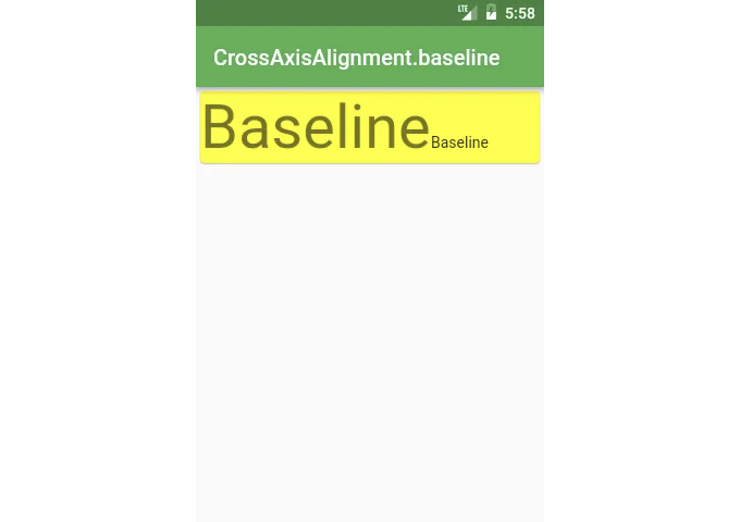
다른 텍스트의 기준선을 정렬해야 한다면 CrossAxisAlignment.baseline을 사용해야 합니다.
Row(
crossAxisAlignment: CrossAxisAlignment.baseline,
textBaseline: TextBaseline.alphabetic,
children:
CrossAxisAlignment
Row /or Column/(
crossAxisAlignment: CrossAxisAlignment.start,
children:
Row /or Column/(
crossAxisAlignment: CrossAxisAlignment.center,
children:
Row /*또는 Column*/(
  crossAxisAlignment: CrossAxisAlignment.end,
  children: <Widget>[
    Icon(Icons.star, size: 50),
    Icon(Icons.star, size: 200),
    Icon(Icons.star, size: 50),
  ],
),
Row /*또는 Column*/(
  crossAxisAlignment: CrossAxisAlignment.stretch,
  children: <Widget>[
    Icon(Icons.star, size: 50),
    Icon(Icons.star, size: 200),
    Icon(Icons.star, size: 50),
  ],
),
MainAxisSize
Row /*또는 Column*/(
  mainAxisSize: MainAxisSize.max,
  children: <Widget>[
    Icon(Icons.star, size: 50),
    Icon(Icons.star, size: 50),
    Icon(Icons.star, size: 50),
  ],
),
Row /or Column/(
mainAxisSize: MainAxisSize.min,
children:
IntrinsicWidth and IntrinsicHeight
Want all the widgets inside Row or Column to be as tall/wide as the tallest/widest widget? Search no more!
In case you have this kind of layout:
위젯 build(BuildContext context) {
  return Scaffold(
    appBar: AppBar(title: Text('IntrinsicWidth')),
    body: Center(
      child: Column(
        children: <Widget>[
          RaisedButton(
            onPressed: () {},
            child: Text('Short'),
          ),
          RaisedButton(
            onPressed: () {},
            child: Text('A bit Longer'),
          ),
          RaisedButton(
            onPressed: () {},
            child: Text('The Longest text button'),
          ),
        ],
      ),
    ),
  );
}
만약 모든 버튼을 가장 넓은 것처럼 넓게 만들고 싶다면 IntrinsicWidth를 사용하세요:
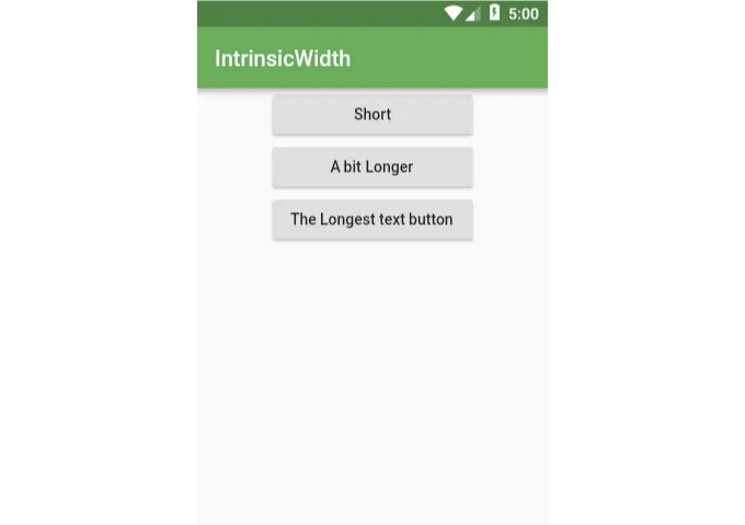
위젯 build(BuildContext context) {
  return Scaffold(
    appBar: AppBar(title: Text('IntrinsicWidth')),
    body: Center(
      child: IntrinsicWidth(
        child: Column(
          crossAxisAlignment: CrossAxisAlignment.stretch,
          children: <Widget>[
            RaisedButton(
              onPressed: () {},
              child: Text('Short'),
            ),
            RaisedButton(
              onPressed: () {},
              child: Text('A bit Longer'),
            ),
            RaisedButton(
              onPressed: () {},
              child: Text('The Longest text button'),
            ),
          ],
        ),
      ),
    ),
  );
}

비슷한 문제가 있지만 위젯을 가장 큰 높이에 맞추고 싶다면 IntrinsicHeight와 Row 위젯의 조합을 사용하면 됩니다.

# Stack

위젯을 서로 겹쳐 놓을 때 사용합니다.
@override
Widget build(BuildContext context) {
  Widget main = Scaffold(
    appBar: AppBar(title: Text('Stack')),
  );

  return Stack(
    fit: StackFit.expand,
    children: <Widget>[
      main,
      Banner(
        message: "Top Start",
        location: BannerLocation.topStart,
      ),
      Banner(
        message: "Top End",
        location: BannerLocation.topEnd,
      ),
      Banner(
        message: "Bottom Start",
        location: BannerLocation.bottomStart,
      ),
      Banner(
        message: "Bottom End",
        location: BannerLocation.bottomEnd,
      ),
    ],
  );
}
자체 위젯을 사용하려면 Positioned 위젯에 배치하셔야 합니다.
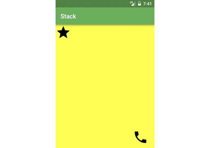
위젯 build(BuildContext context) {
  return Scaffold(
    appBar: AppBar(title: Text('Stack')),
    body: Stack(
      fit: StackFit.expand,
      children: <Widget>[
        Material(color: Colors.yellowAccent),
        Positioned(
          top: 0,
          left: 0,
          child: Icon(Icons.star, size: 50),
        ),
        Positioned(
          top: 340,
          left: 250,
          child: Icon(Icons.call, size: 50),
        ),
      ],
    ),
  );
}
만약 상하값을 추측하기 싫다면 LayoutBuilder를 사용하여 값을 가져올 수 있어요
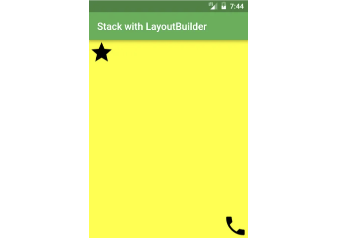
Widget build(BuildContext context) {
  const iconSize = 50;
  return Scaffold(
    appBar: AppBar(title: Text('Stack with LayoutBuilder')),
    body: LayoutBuilder(
      builder: (context, constraints) =>
        Stack(
          fit: StackFit.expand,
          children: <Widget>[
            Material(color: Colors.yellowAccent),
            Positioned(
              top: 0,
              child: Icon(Icons.star, size: iconSize),
            ),
            Positioned(
              top: constraints.maxHeight - iconSize,
              left: constraints.maxWidth - iconSize,
              child: Icon(Icons.call, size: iconSize),
            ),
          ],
        ),
    ),
  );
}
확장된
확장된은 Flexbox 레이아웃과 함께 작동하며 여러 항목 간의 공간을 효율적으로 분배하는 데 좋습니다.
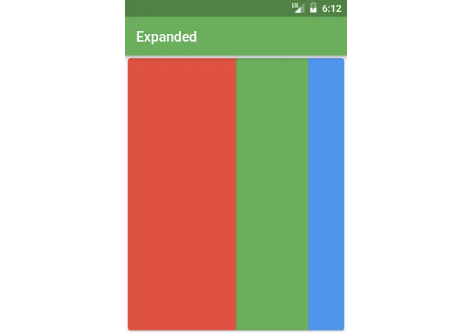
Row(
  children: <Widget>[
    Expanded(
      child: Container(
        decoration: const BoxDecoration(color: Colors.red),
      ),
      flex: 3,
    ),
    Expanded(
      child: Container(
        decoration: const BoxDecoration(color: Colors.green),
      ),
      flex: 2,
    ),
    Expanded(
      child: Container(
        decoration: const BoxDecoration(color: Colors.blue),
      ),
      flex: 1,
    ),
  ],
),
ConstrainedBox
기본적으로 대부분의 위젯은 가능한 한 적은 공간을 사용합니다:
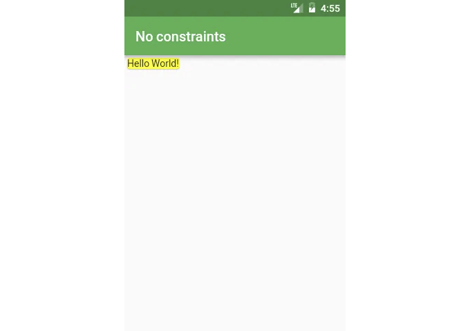
Card(child: const Text('Hello World!'), color: Colors.yellow)
ConstrainedBox 위젯을 사용하면 원하는 대로 남은 공간을 활용할 수 있어요.
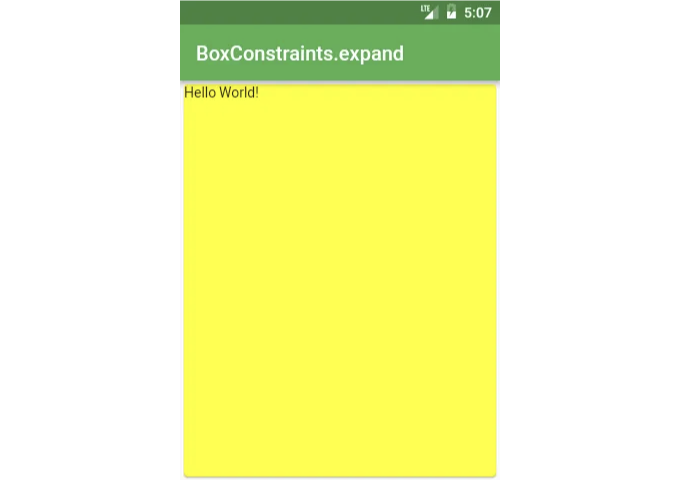
ConstrainedBox(
  constraints: BoxConstraints.expand(),
  child: const Card(
    child: const Text('Hello World!'),
    color: Colors.yellow,
  ),
),
BoxConstraints를 사용하면 위젯이 차지할 수 있는 공간의 양을 지정할 수 있어요. 높이와 너비의 최소 및 최대 값을 지정해요.
다음은 BoxConstraints.expand을 사용할 때의 동작입니다:
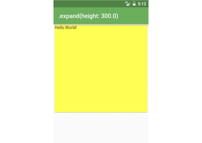
ConstrainedBox(
  constraints: BoxConstraints.expand(height: 300),
  child: const Card(
    child: const Text('Hello World!'),
    color: Colors.yellow,
  ),
),
이것은 다음과 동일합니다:
ConstrainedBox(
  constraints: BoxConstraints(
    minWidth: double.infinity,
    maxWidth: double.infinity,
    minHeight: 300,
    maxHeight: 300,
  ),
  child: const Card(
    child: const Text('Hello World!'),
    color: Colors.yellow,
  ),
),
Align
때때로 위젯을 적절한 크기로 설정하는 데 어려움을 겪을 때가 있습니다. 예를 들어, 원치 않는 스트레칭이 계속 발생하는 경우가 있습니다:
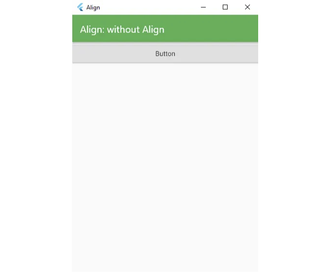
위와 같은 상황이 발생하는 예시는 Column에 CrossAxisAlignment.stretch를 가진 경우이며, 버튼만 늘어지지 않도록 원할 때 발생합니다:
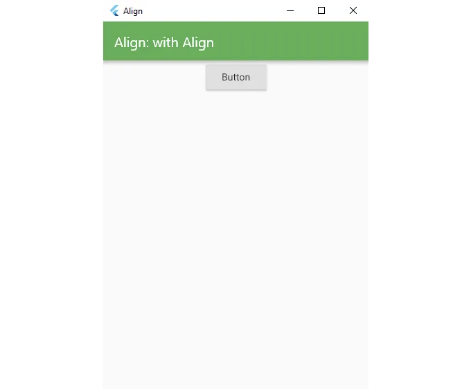
Widget build(BuildContext context) {
  return Scaffold(
    appBar: AppBar(title: Text('Align: without Align')),
    body: Column(
      crossAxisAlignment: CrossAxisAlignment.stretch,
      children: <Widget>[
        Align(
          child: RaisedButton(
            onPressed: () {},
            child: const Text('Button'),
          ),
        ),
      ],
    ),
  );
}
위젯이 설정한 제약을 수용하지 않을 때는 첫 번째로 Align으로 감싸 보세요.
컨테이너
가장 많이 사용되는 위젯 중 하나입니다! 그리고 그 이유가 있어요:
레이아웃 도구로서의 컨테이너
컨테이너의 높이와 너비를 지정하지 않으면, 자식 요소의 크기에 맞추게 됩니다
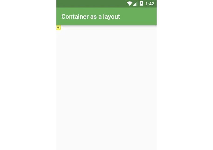
Widget build(BuildContext context) {
  return Scaffold(
    appBar: AppBar(title: Text('Container as a layout')),
    body: Container(
      color: Colors.yellowAccent,
      child: Text("Hi"),
    ),
  );
}
If you want to stretch the Container to match its parent, use double.infinity for the height and width properties
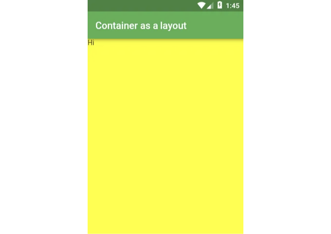
위젯 build(BuildContext context) {
    return Scaffold(
        appBar: AppBar(title: Text('Container를 레이아웃으로 사용하기')),
        body: Container(
            height: double.infinity,
            width: double.infinity,
            color: Colors.yellowAccent,
            child: Text("안녕하세요"),
        ),
    );
}
Decoration으로 Container 스타일링
Container의 배경에 영향을 주기 위해 color 속성을 사용할 수 있습니다. 그러나 decoration 및 foregroundDecoration을 사용할 수도 있습니다. (이 두 속성을 사용하면 Container의 전체적인 모양을 완전히 바꿀 수 있지만 이후에 다른 스타일에 대해 이야기할 것입니다. 그것은 꽤 큰 주제이기 때문에!) decoration은 항상 자식 위에 배치되지만, foregroundDecoration은 자식 위에 배치됩니다.
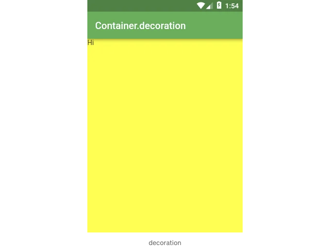
위젯 빌드(BuildContext context) {
  return Scaffold(
    appBar: AppBar(title: Text('Container.decoration')),
    body: Container(
      height: double.infinity,
      width: double.infinity,
      decoration: BoxDecoration(color: Colors.yellowAccent),
      child: Text("안녕하세요"),
    ),
  );
}
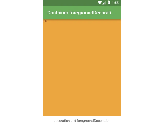
위젯 빌드(BuildContext context) {
  return Scaffold(
    appBar: AppBar(title: Text('Container.foregroundDecoration')),
    body: Container(
      height: double.infinity,
      width: double.infinity,
      decoration: BoxDecoration(color: Colors.yellowAccent),
      foregroundDecoration: BoxDecoration(
        color: Colors.red.withOpacity(0.5),
      ),
      child: Text("안녕하세요"),
    ),
  );
}
Transform으로서의 Container
만약 레이아웃을 변경하기 위해 Transform 위젯을 사용하고 싶지 않다면, Container에서 직접 transform 속성을 사용할 수 있습니다.
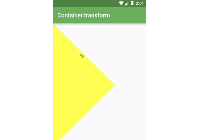
Widget build(BuildContext context) {
  return Scaffold(
    appBar: AppBar(title: Text('Container.transform')),
    body: Container(
      height: 300,
      width: 300,
      transform: Matrix4.rotationZ(pi / 4),
      decoration: BoxDecoration(color: Colors.yellowAccent),
      child: Text(
        "안녕",
        textAlign: TextAlign.center,
      ),
    ),
  );
}
BoxDecoration
일반적으로 장식은 컨테이너 위젯에 사용되어 컨테이너가 어떻게 보이는지를 변경합니다.
이미지: DecorationImage
배경으로 이미지를 넣습니다:
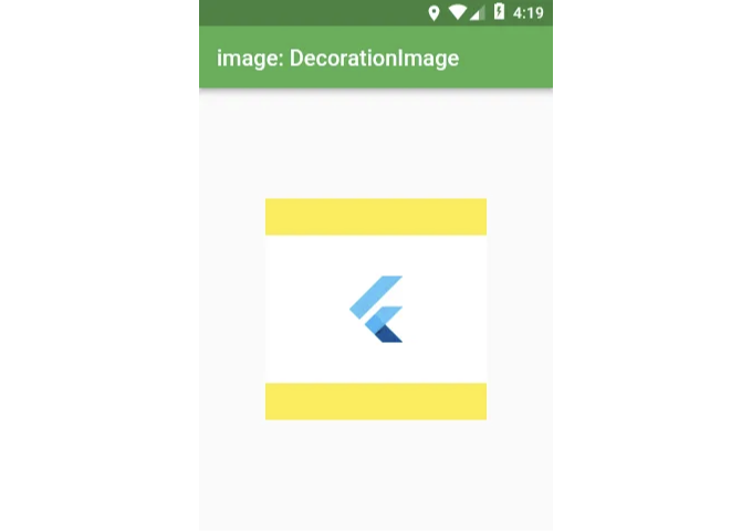
Scaffold(
  appBar: AppBar(title: Text('image: DecorationImage')),
  body: Center(
    child: Container(
      height: 200,
      width: 200,
      decoration: BoxDecoration(
        color: Colors.yellow,
        image: DecorationImage(
          fit: BoxFit.fitWidth,
          image: NetworkImage(
            'https://flutter.io/images/catalog-widget-placeholder.png',
          ),
        ),
      ),
    ),
  ),
);
border: Border
Container의 테두리가 어떻게 보일지를 지정합니다.
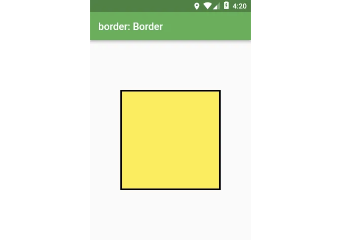
Scaffold(
  appBar: AppBar(title: Text('border: Border')),
  body: Center(
    child: Container(
      height: 200,
      width: 200,
      decoration: BoxDecoration(
        color: Colors.yellow,
        border: Border.all(color: Colors.black, width: 3),
      ),
    ),
  ),
);
borderRadius: BorderRadius
모서리를 둥글게 만듭니다.
decoration의 모양이 BoxShape.circle인 경우 borderRadius는 작동하지 않습니다.
Scaffold(
  appBar: AppBar(title: Text('borderRadius: BorderRadius')),
  body: Center(
    child: Container(
      height: 200,
      width: 200,
      decoration: BoxDecoration(
        color: Colors.yellow,
        border: Border.all(color: Colors.black, width: 3),
        borderRadius: BorderRadius.all(Radius.circular(18)),
      ),
    ),
  ),
);
shape: BoxShape
박스의 장식은 사각형/정사각형 또는 타원/원이 될 수 있습니다.
다른 모양을 사용하려면 BoxDecoration 대신 ShapeDecoration을 사용할 수 있습니다.
Scaffold(
  appBar: AppBar(title: Text('shape: BoxShape')),
  body: Center(
    child: Container(
      height: 200,
      width: 200,
      decoration: ShapeDecoration(
        color: Colors.yellow,
        shape: BoxShape.circle,
      ),
    ),
  ),
);
boxShadow: ListBoxShadow
아래는 Container에 그림자를 추가한 코드입니다.
이 매개변수는 여러 가지 그림자를 지정하고 병합할 수 있으므로 목록 형태로 제공됩니다.
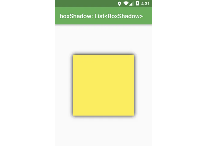
Scaffold(
  appBar: AppBar(title: Text('boxShadow: List<BoxShadow>')),
  body: Center(
    child: Container(
      height: 200,
      width: 200,
      decoration: BoxDecoration(
        color: Colors.yellow,
        boxShadow: const [
          BoxShadow(blurRadius: 10),
        ],
      ),
    ),
  ),
);
그라데이션
그라데이션에는 선형 그라데이션(LinearGradient), 원형 그라데이션(RadialGradient) 및 스윕 그라데이션(SweepGradient) 세 가지 유형이 있습니다.
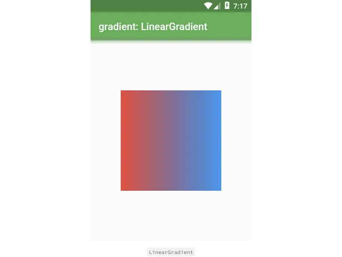
Scaffold(
  appBar: AppBar(title: Text('gradient: LinearGradient')),
  body: Center(
    child: Container(
      height: 200,
      width: 200,
      decoration: BoxDecoration(
        gradient: LinearGradient(
          colors: const [
            Colors.red,
            Colors.blue,
          ],
        ),
      ),
    ),
  ),
);
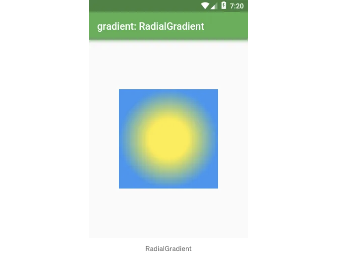
Scaffold(
  appBar: AppBar(title: Text('gradient: RadialGradient')),
  body: Center(
    child: Container(
      height: 200,
      width: 200,
      decoration: BoxDecoration(
        gradient: RadialGradient(
          colors: const [Colors.yellow, Colors.blue],
          stops: const [0.4, 1.0],
        ),
      ),
    ),
  ),
);
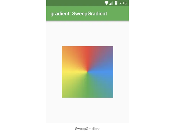
Scaffold(
  appBar: AppBar(title: Text('gradient: SweepGradient')),
  body: Center(
    child: Container(
      height: 200,
      width: 200,
      decoration: BoxDecoration(
        gradient: SweepGradient(
          colors: const [
            Colors.blue,
            Colors.green,
            Colors.yellow,
            Colors.red,
            Colors.blue,
          ],
          stops: const [0.0, 0.25, 0.5, 0.75, 1.0],
        ),
      ),
    ),
  ),
);
backgroundBlendMode
backgroundBlendMode은 BoxDecoration의 가장 복잡한 속성입니다.
이 속성은 BoxDecoration의 색상/그라데이션을 섞고, BoxDecoration이 위에 있는 것과 혼합하는 역할을 합니다.
backgroundBlendMode를 사용하면 BlendMode 열거형에서 지정된 다양한 알고리즘을 사용할 수 있습니다.
먼저, backgroundBlendMode를 사용하여 Container의 자식 위에 그려지는 foregroundDecoration을 BoxDecoration으로 설정해 봅시다. (반면 decoration은 자식 뒤에 그려집니다)
Scaffold(
  appBar: AppBar(title: Text('backgroundBlendMode')),
  body: Center(
    child: Container(
      height: 200,
      width: 200,
      foregroundDecoration: BoxDecoration(
        backgroundBlendMode: BlendMode.exclusion,
        gradient: LinearGradient(
          colors: const [
            Colors.red,
            Colors.blue,
          ],
        ),
      ),
      child: Image.network(
        'https://flutter.io/images/catalog-widget-placeholder.png',
      ),
    ),
  ),
);
backgroundBlendMode은 해당 Container에만 영향을 미치는 것이 아닙니다.
backgroundBlendMode은 Container에서 상위 위젯 트리에 올라가 있는 모든 색상을 변경합니다.
아래 코드는 이미지를 그리는 부모 Container와 backgroundBlendMode를 사용하는 자식 Container가 있지만, 이전과 동일한 효과를 얻을 수 있습니다.
Scaffold(
  appBar: AppBar(title: Text('backgroundBlendMode')),
  body: Center(
    child: Container(
      decoration: BoxDecoration(
        image: DecorationImage(
          image: NetworkImage(
            'https://flutter.io/images/catalog-widget-placeholder.png',
          ),
        ),
      ),
      child: Container(
        height: 200,
        width: 200,
        foregroundDecoration: BoxDecoration(
          backgroundBlendMode: BlendMode.exclusion,
          gradient: LinearGradient(
            colors: const [
              Colors.red,
              Colors.blue,
            ],
          ),
        ),
      ),
    ),
  ),
);
Material
Border with cut corners
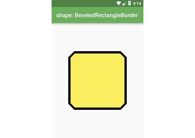
Scaffold(
  appBar: AppBar(title: Text('shape: BeveledRectangleBorder')),
  body: Center(
    child: Material(
      shape: const BeveledRectangleBorder(
        borderRadius: BorderRadius.all(Radius.circular(20)),
        side: BorderSide(color: Colors.black, width: 4),
      ),
      color: Colors.yellow,
      child: Container(
        height: 200,
        width: 200,
      ),
    ),
  ),
);
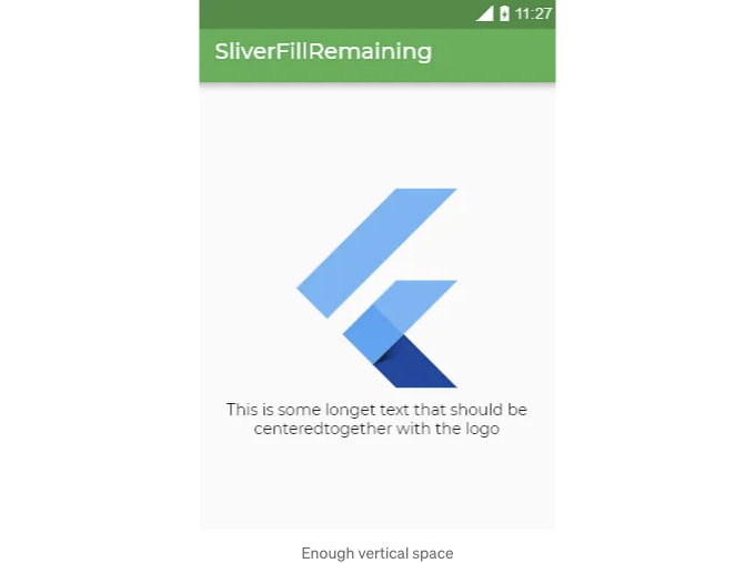
Slivers
SliverFillRemaining
이 위젯은 콘텐츠를 중앙 정렬하고 싶을 때 공간이 충분하지 않은 경우에 교체할 수 없습니다. 대화형 예제 있어요!
Scaffold(
  appBar: AppBar(title: Text('SliverFillRemaining')),
  body: CustomScrollView(
    slivers: [
      SliverFillRemaining(
        hasScrollBody: false,
        child: Column(
          mainAxisAlignment: MainAxisAlignment.center,
          children: const [
            FlutterLogo(size: 200),
            Text(
              '로고와 함께 중앙 정렬되어야 하는 가장 긴 텍스트입니다',
              textAlign: TextAlign.center,
            ),
          ],
        ),
      ),
    ],
  ),
);
중앙 정렬된 콘텐츠에 공간이 충분하지 않은 경우 SliverFillRemaining이 스크롤 가능해집니다.
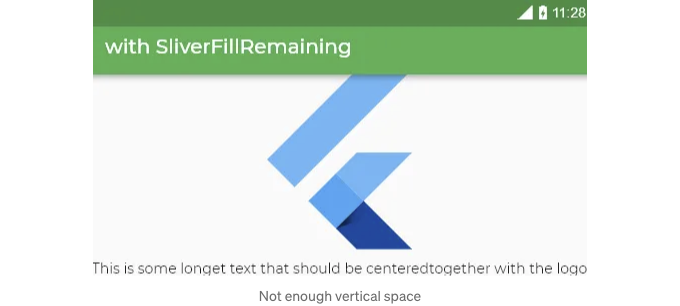
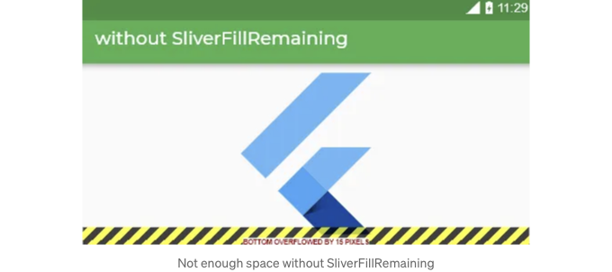
만약 SliverFillRemaining이 없었다면 컨텐츠가 이렇게 오버플로될 것입니다:
남은 공간 채우기
내용을 가운데 정렬하는 데 유용한 SliverFillRemaining은 뷰포트의 여유 공간을 채웁니다. 이 위젯을 사용하려면 CustomScrollView에 배치되어야하며 마지막 슬리버여야합니다.
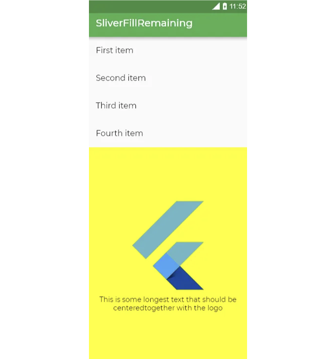
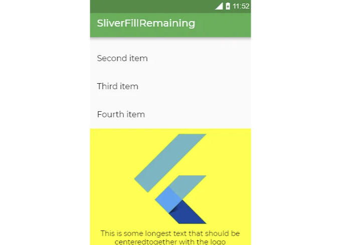
공간이 충분하지 않은 경우 위젯은 스크롤 가능해집니다.
Scaffold(
  appBar: AppBar(title: Text('SliverFillRemaining')),
  body: CustomScrollView(
    slivers: [
      SliverList(
        delegate: SliverChildListDelegate(const [
          ListTile(title: Text('First item')),
          ListTile(title: Text('Second item')),
          ListTile(title: Text('Third item')),
          ListTile(title: Text('Fourth item')),
        ]),
      ),
      SliverFillRemaining(
        hasScrollBody: false,
        child: Container(
          color: Colors.yellowAccent,
          child: Column(
            mainAxisAlignment: MainAxisAlignment.center,
            children: const [
              FlutterLogo(size: 200),
              Text(
                'This is some longest text that should be centered'
                'together with the logo',
                textAlign: TextAlign.center,
              ),
            ],
          ),
        ),
      ),
    ],
  ),
);
SizedBox
가장 간단하지만 가장 유용한 위젯 중 하나입니다
ConstrainedBox로서의 SizedBox
SizedBox는 ConstrainedBox와 비슷한 방식으로 작동할 수 있어요.
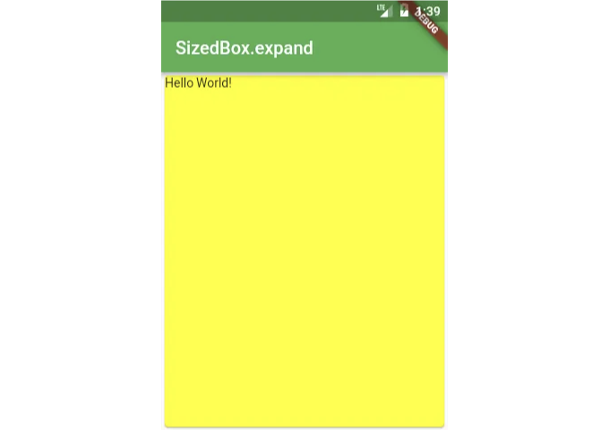
SizedBox.expand(
  child: Card(
    child: Text('Hello World!'),
    color: Colors.yellowAccent,
  ),
),
SizedBox를 패딩으로 사용하기
여백이나 여백을 추가해야 할 때는 Padding 또는 Container 위젯을 선택할 수 있습니다. 그러나 이러한 방식은 Sizedbox를 추가하는 것보다 더 길고 가독성이 떨어질 수 있습니다.
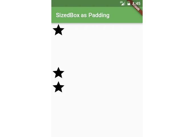
Column(
  children: <Widget>[
    Icon(Icons.star, size: 50),
    const SizedBox(height: 100),
    Icon(Icons.star, size: 50),
    Icon(Icons.star, size: 50),
  ],
),
SizedBox를 사용한 보이지 않는 객체
많은 시간에 따라 위젯을 숨기거나 표시하고 싶을 때가 많습니다.
Widget build(BuildContext context) {
  bool isVisible = ...
  return Scaffold(
    appBar: AppBar(
      title: Text('isVisible = $isVisible'),
    ),
    body: isVisible
      ? Icon(Icons.star, size: 150)
      : const SizedBox(),
  );
}
SizedBox에는 const 생성자가 있으므로 const SizedBox()를 사용하는 것이 정말 저렴합니다**.
**보다 저렴한 해결책은 Opacity 위젯을 사용하고 투명도 값을 0.0으로 변경하는 것입니다. 이 해결책의 단점은 주어진 위젯이 보이지 않을 뿐 아직 공간을 차지할 것이라는 점입니다.
SafeArea
다양한 플랫폼에서 안드로이드의 상태 바(Status Bar)나 아이폰 X의 노치(Notch)와 같은 특별한 영역이 있습니다.
이러한 영역 아래에는 그리기를 피할 필요가 있습니다.
이 문제의 해결책은 SafeArea 위젯입니다 (SafeArea를 사용한 예시).
Widget build(BuildContext context) {
  return Material(
    color: Colors.blue,
    child: SafeArea(
      child: SizedBox.expand(
        child: Card(color: Colors.yellowAccent),
      ),
    ),
  );
}
중요한 질문이 있으시면 놓치지 않으려면 트위터에서 저에게 개인 메시지를 보내주세요!