CSS는 두 가지 주요 애니메이션 방법을 제공해요:
- 간단한 방법(가상 클래스 사용)
- 고급 방법(키프레임 사용)
이제 그것들을 어떻게 사용하는지 알아볼까요!
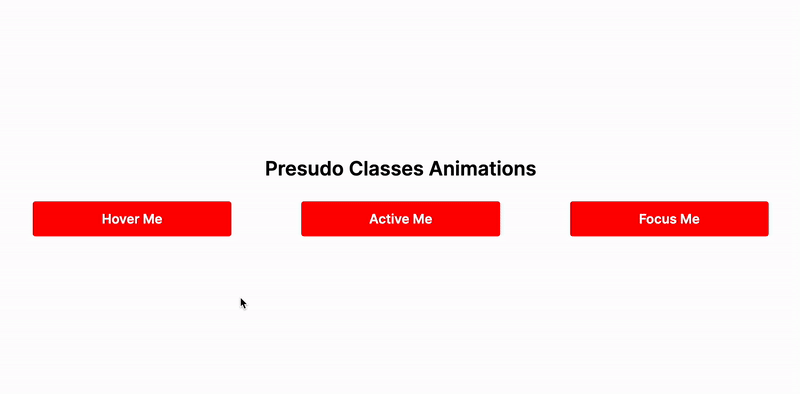
간단한 애니메이션
이 모든 것은 누군가가 페이지와 상호 작용했을 때 특수 효과를 사용하는 방법에 대한 것입니다. 마우스를 올리면 펄스하는 버튼이나 누군가가 클릭했을 때 흔들리는 텍스트 상자를 상상해보세요.
다음은 그 방법입니다:
- .class:hover: 사용자가 마우스 커서로 요소 위로 올릴 때 스타일을 적용합니다.
- .class:active: 사용자가 요소를 클릭하고 마우스 버튼을 누르고 있을 때 스타일을 적용합니다.
- .class:focus: 요소가 포커스를 받았을 때(예: 클릭하거나 탭할 때) 스타일을 적용합니다.
의사 클래스를 사용하려면 요소의 클래스에 :hover를 추가해야합니다. 호버 시 스타일을 변경하려는 요소에 이를 추가하십시오:
.class {
  background-color: red;
  padding: 1rem;
  color: white;
  border-radius: 0.3rem;

  /* 전환을 부드럽게 만드는 방법 */
  transition: background-color 0.3s ease-in-out;
}

.class:hover {
  background-color: blue;
}

/* 또는 */

.class:active {
  background-color: blue;
}

/* 또는 */

.class:focus {
  background-color: blue;
}
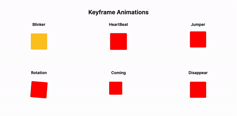
고급 애니메이션
화려한 애니메이션은 @keyframes라고 불리는 특별한 규칙으로 만들어집니다.
구현은 다음과 같습니다:
@keyframes blinker {
  from {
    background-color: red;
  }
  to {
    background-color: yellow;
  }
}

.blinker-div {
  width: 100px;
  height: 100px;
  border-radius: 5%;

  animation-name: blinker;
  animation-duration: 1s;
  animation-iteration-count: infinite;
  animation-timing-function: ease-in-out;
  animation-direction: alternate;
}
또한 각 부분이 애니메이션 중에 어떻게 보이는지를 백분율(%)을 사용하여 설정할 수 있습니다:
@keyframes heartbeat {
  0% {
    transform: scale(1);
  }
  25% {
    transform: scale(1.1);
  }
  100% {
    transform: scale(1);
  }
}

.heartbeat-div {
  width: 100px;
  height: 100px;
  border-radius: 5%;
  background-color: red;

  animation-name: heartbeat;
  animation-duration: 0.6s;
  animation-iteration-count: infinite;
  animation-direction: alternate;
}
이를 통해 애니메이션의 각 지점에서 요소에 무엇이 발생하는지 설정하여 멋진 효과를 만들 수 있습니다.
단축 형식을 사용할 수도 있습니다:
animation: heartbeat 0.6s infinite ease-in-out alternate 3s;
그걸로 끝이에요! ✨
관련 기사:
링크 섹션:
☕️ 커피 사주세요. 📚 Keyframes 애니메이션 문서.