지금까지 많은 분들이 Vue.js를 사용하여 멋진 상호 작용 위젯을 손쉽게 만드는 방법에 대해 자습서를 제작해달라고 요청해 왔습니다. 실제로 제겐 열정이었죠. Composition API 덕분에 Vue로 아주 간단하게 아름다운 것들을 만들 수 있고 여러분의 창의적인 비전에는 제약이 없습니다. 오늘은 핵심 라이브러리와 기본 HTML, JavaScript, CSS만을 사용하여 Vue 3로 일반적인 방식으로 모든 것을 구현하는 방법을 가르쳐 드릴 거에요.
프로젝트 설정
먼저, 프로젝트를 생성하고 (모든 선택지에서 엔터를 눌러 선택하지 않음) 시작합니다:
$ npm create vue@latest --name vue-masterclass-clock
$ cd vue-masterclass-clock
$ npm install
$ npm run dev
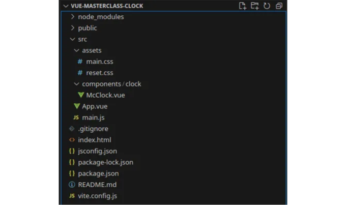
이제 기본 프로젝트가 생성되었습니다. 이제 프로젝트를 정리하여 위젯에 집중할 수 있도록 하겠습니다. 먼저 src 폴더 내부에서 필요없는 파일을 모두 제거하여 파일 시스템이 다음과 같이 보이도록합니다:
reset.css는 기본 CSS 초기화 파일입니다.
/* http://meyerweb.com/eric/tools/css/reset/
   v2.0 | 20110126
   License: none (public domain)
*/

html, body, div, span, applet, object, iframe,
h1, h2, h3, h4, h5, h6, p, blockquote, pre,
a, abbr, acronym, address, big, cite, code,
del, dfn, em, img, ins, kbd, q, s, samp,
small, strike, strong, sub, sup, tt, var,
b, u, i, center,
dl, dt, dd, ol, ul, li,
fieldset, form, label, legend,
table, caption, tbody, tfoot, thead, tr, th, td,
article, aside, canvas, details, embed,
figure, figcaption, footer, header, hgroup,
menu, nav, output, ruby, section, summary,
time, mark, audio, video {
 margin: 0;
 padding: 0;
 border: 0;
 font-size: 100%;
 font: inherit;
 vertical-align: baseline;
}
/* HTML5 display-role reset for older browsers */
article, aside, details, figcaption, figure,
footer, header, hgroup, menu, nav, section {
 display: block;
}
body {
 line-height: 1;
}
ol, ul {
 list-style: none;
}
blockquote, q {
 quotes: none;
}
blockquote:before, blockquote:after,
q:before, q:after {
 content: '';
 content: none;
}
table {
 border-collapse: collapse;
 border-spacing: 0;
}
main.css 파일은 단순히 한 파일을 임포트합니다:
@import './reset.css';
App.vue는 단지 컴포넌트를 감싸는 래퍼입니다:
<script setup>
import McClock from './components/clock/McClock.vue'
</script>

<template>
  <McClock></McClock>
</template>
main.js는 변경되지 않았습니다:
import './assets/main.css'

import { createApp } from 'vue'
import App from './App.vue'

createApp(App).mount('#app')
마지막으로, 간단한 컴포넌트인 McClock.vue는 다음과 같습니다:
<template>
    <div>CLOCK</div>
</template>
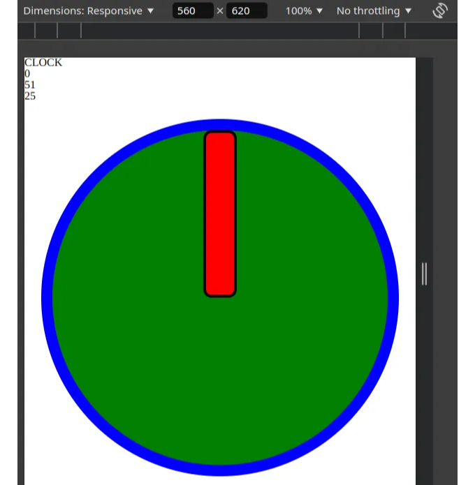
여기에는 다른 내용이 추가되지 않은 단순한 템플릿입니다. 따라서 초안 애플리케이션은 다음과 같습니다:
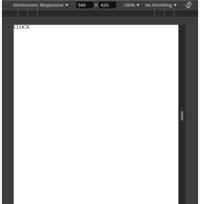
기본 시계
이제 프로젝트 설정을 다루었으니, 시계 작업을 시작할 수 있게 되었습니다. 이런 프로젝트의 경우, 일반적으로 기본 기능부터 시작해서 발전시켜나가는 편입니다. 따라서, 시간을 표시하는 3개의 시계 바늘이 있는 "시계"를 만들어보겠습니다. 이를 위해 처음부터 해결해야 할 두 가지 문제가 있습니다:
- 현재 시간, 분, 초 값을 반응적 변수에 바인딩하는 방법
- 숫자 값에 기반한 위치를 가지는 시계 바늘
첫 번째 문제부터 시작해봅시다:
우선, 초기 날짜를 기반으로 시, 분, 초를 계산하는 매우 간단한 로직을 만들어봅시다:
<script setup>
import { ref, computed } from "vue";

const currentDate = ref(new Date());
const hours = computed(() => currentDate.value.getHours());
const minutes = computed(() => currentDate.value.getMinutes());
const seconds = computed(() => currentDate.value.getSeconds());
</script>

<template>
    <div>CLOCK</div>
    <div>{ hours }</div>
    <div>{ minutes }</div>
    <div>{ seconds }</div>
</template>
이 로직의 문제점은 시간이 흐름에 따라 업데이트되지 않는다는 것입니다. 따라서 주기적으로 업데이트하는 함수를 만들어야 합니다:
import { ref, computed, onMounted, onBeforeUnmount } from "vue";

//...

function updateCurrentDate() {
    currentDate.value = new Date();
    getNextTick();
}
let timeout = null;
function getNextTick() {
    const milliseconds = (new Date()).getMilliseconds();
    timeout = setTimeout(updateCurrentDate, 1000 - milliseconds);
}
onMounted(() => {
    getNextTick();
})
onBeforeUnmount(() => {
    clearTimeout(timeout);
})
콘솔을 확인하면 두 번째가 변경된 직후에 함수가 거의 신뢰할만큼 호출된다는 것을 알 수 있습니다. 이제 콘솔 로그를 삭제하겠습니다. 이는 함수가 초의 시작에서 바로 호출되며 시작한 지 최대 한 밀리초가 경과했음을 표시하기 위한 것입니다. 이미 지난 밀리초 수를 확인하고, 이것을 1000에서 빼서 초의 나머지 전체를 기다리기 때문에 그렇습니다.
그러면 첫 번째 부분이 끝났으므로, 두 번째 문제로 넘어갈 수 있어요:
우리가 의도한대로 시간을 표시하는 시계 바늘 컴포넌트를 만들어야 합니다.
먼저, 우리 시계의 개요를 만들어 봅시다:
<script setup>

//...

const clockMargin = ref("24px");
</script>

<template>
    <div>CLOCK</div>
    <div>{ hours }</div>
    <div>{ minutes }</div>
    <div>{ seconds }</div>

    <div class="mc-clock-area">

    </div>
</template>

<style scoped>
.mc-clock-area {
    margin: v-bind(clockMargin);
    position: relative;
    width: calc(100% - v-bind(clockMargin) * 2);
    aspect-ratio: 1;
    background-color: green;
    border-radius: 50%;
    border-width: 16px;
    border-style: solid;
    border-color: blue;
    box-sizing: border-box;
}
</style>
그렇게 하면 다음과 같이 보일 것입니다:
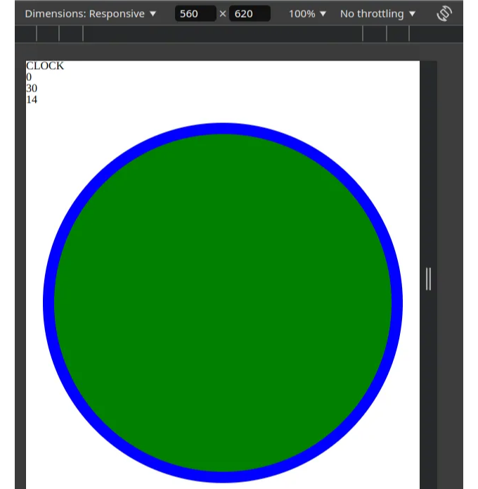
이 시점에서 몇 가지가 눈에 띕니다:
- clockMargin은 JavaScript 부분에서 설정됩니다. 이 부분은 특히 멋지며 위젯 속성으로 마진을 설정할 수 있도록 합니다. 이를 통해 우리는 나중에 동일한 구성 요소로 더 많은 유연한 시계를 가질 수 있습니다.
- position은 상대적으로 설정되었는데, 이는 이어서 나오는 시계 바늘들에서 절대 위치를 사용할 것이기 때문입니다.
- 구성 요소의 너비는 calc 함수를 사용합니다. - calc는 당신의 친구입니다! calc를 두려워하지 마세요. 이것은 CSS의 가장 놀라운 부분 중 하나로, 그렇지 않으면 어렵게 원하는 대로 할 수 있게 해줍니다.
- Aspect-ratio는 CSS의 숨겨진 보석 중 하나입니다. 이를 사용하면 구성 요소가 정적인 경우에도 높이를 걱정할 필요가 없습니다.
- border 속성은 잘 알려져 있으므로 설명할 필요가 없을 것 같지만, box-sizing을 잊지 마세요! box-sizing은 테두리가 이전에 설정된 크기 내에 맞도록 만들어 주며 그 반대로는 되지 않게 합니다. 이 속성을 발견하기 전에 테두리와 크기 계산에 얼마나 고생했는지 말할 수 없을 정도입니다.
이제 시계바늘을 만들어 보겠습니다!
우리는 McClock.vue 파일 옆에 McClockHand.vue라는 새 파일을 만들어 시계 폴더 안에 넣을 것입니다:
<script setup>
const props = defineProps({
    position: Number,
    positionMax: Number
})
</script>

<template>
    <div class="mc-clock-hand"></div>
</template>

<style scoped>
.mc-clock-hand {
    position: absolute;
    width: 10%;
    height: 50%;
    background-color: red;
    top: 50%;
    left: 50%;
    transform-origin: top center;
    transform: translate(-50%, 0%) rotate(180deg);
    border-radius: 12px;
    border-width: 4px;
    border-style: solid;
    border-color: black;
    box-sizing: border-box;
}
</style>
또한, 우리의 메인 컴포넌트에 이 파일을 포함시킵니다:
<script setup>
import McClockHand from "./McClockHand.vue"
// ...
</script>

<template>
    <div>CLOCK</div>
    <div>{ hours }</div>
    <div>{ minutes }</div>
    <div>{ seconds }</div>

    <div class="mc-clock-area">
        <McClockHand></McClockHand>
    </div>
</template>
위와 같이 변경하면 결과물은 아래와 같을 것입니다:
다시 한 번 매우 간단합니다. 여기서 중요한 부분 몇 가지를 살펴봅시다. 하나씩 중요한 부분을 다시 한 번 확인해 보죠.
- Position absolute를 사용하면 시계 바늘을 자유롭게 이동시킬 수 있습니다. 그러나 이것만으로는 회전하지 않습니다. 그래서 변형을 사용해야 합니다. 이 경우에는 다음과 같은 조합으로 잘 할 수 있습니다:
- 시계 바늘의 크기를 조절하여 우리의 필요에 맞게 만듭니다. 너비: 10% 및 높이: 50%. 이렇게 하면 시계 바늘이 올바른 크기가 됩니다.
- 다음으로 대략적으로 위치를 조정합니다. 시계를 시계의 중심에 고정하려고 합니다. 즉, top: 50%, left: 50%입니다.
- 그런 다음 회전 방향이 시계가 얇은 쪽의 중간에 대해 상대적으로 발생하도록 변형됩니다. transform-origin: top center로 이 작업을 수행합니다.
- 마지막으로 시계 바늘을 회전시켜 그 자리에 놓습니다. transform: translate(-50%, 0%) rotate(180deg).
이것으로 거의 끝났습니다. 이제 시간에 따라 시계 바늘을 움직이기만 하면 됩니다. 이를 위해 두 개의 시계 바늘을 더 만들고 데이터 흐름을 통과시켜주어야 합니다. 또한 한 가지 더 변경할 예정입니다: 시계 바늘의 길이도 속성으로 만들겠습니다.
McClock.vue의 경우, 이제 다음과 같이 보입니다:
<div class="mc-clock-area">
    <McClockHand :position="hours" :positionMax="24" length="41%" />
    <McClockHand :position="minutes" :positionMax="60" length="48%" />
    <McClockHand :position="seconds" :positionMax="60" length="55%" />
</div>
그리고 McClockHand.vue 파일에 대한 내용입니다:
<script setup>
import { computed } from "vue";
const props = defineProps({
    position: Number,
    positionMax: Number,
    length: String
})

const rotation = computed(() =>
    180 + Math.round((360 * props.position) / props.positionMax) + "deg"
);
</script>

<template>
    <div class="mc-clock-hand"></div>
</template>

<style scoped>
.mc-clock-hand {
    position: absolute;
    width: 10%;
    height: v-bind(length);
    background-color: red;
    top: 50%;
    left: 50%;
    transform-origin: top center;
    transform: translate(-50%, 0%) rotate(v-bind(rotation));
    border-radius: 12px;
    border-width: 4px;
    border-style: solid;
    border-color: black;
    box-sizing: border-box;
}
</style>
이렇게 하면 시계가 다음과 같이 보입니다:
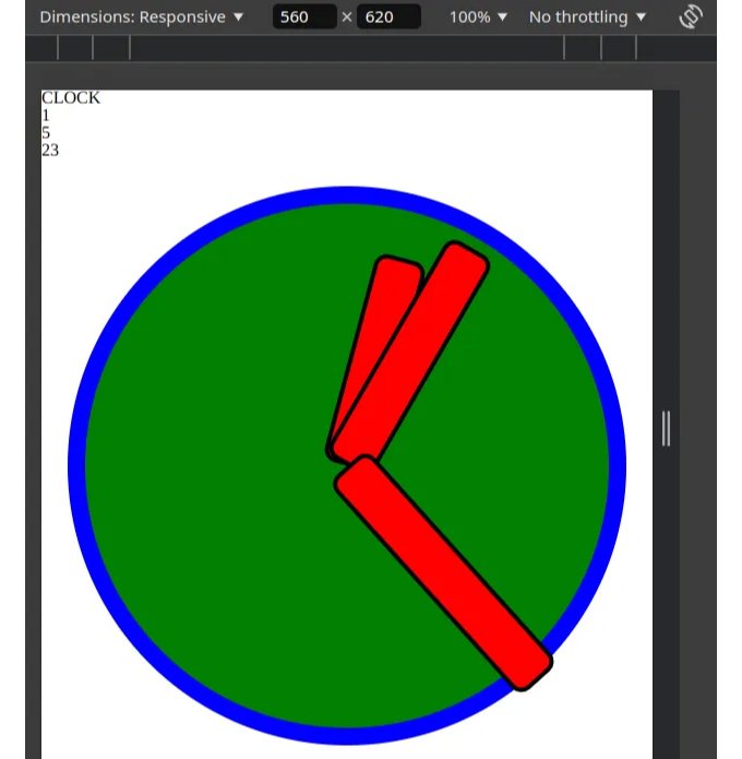
여기에 한 가지 특히 주목할 점이 있습니다: 회전을 생성하는 계산은 "degree"로 끝납니다. 바인딩할 때 CSS로 삽입할 수 있도록 바인딩할 변수는 반드시 문자열이어야 합니다.
이렇게 하여 우리의 기본 시계가 완성되었으며 두 번째 장에서 상호 작용성을 추가할 수 있습니다:
시계를 상호 작용 가능하게 만들기
이제 시간을 표시하는 방법이 있으므로 시간을 설정하고 놀 수 있는 방법도 원합니다. 그를 위해, 먼저 체크박스를 추가하여 틱을 비활성화할 수 있도록하고 작성한 시간 값을 편집할 수 있게 만들 것입니다.
<script setup>
import McClockHand from "./McClockHand.vue"
import { ref, computed, onMounted, onBeforeUnmount } from "vue";

const currentDate = ref(new Date());
const hours = computed({
    get: () => currentDate.value.getHours(),
    set: (value) => {
        if (value == "") return;
        const date = currentDate.value;
        date.setHours(value);
        currentDate.value = new Date(date);
        tick.value = false;
    }
});
const minutes = computed({
    get: () => currentDate.value.getMinutes(),
    set: (value) => {
        if (value == "") return;
        const date = currentDate.value;
        date.setMinutes(value)
        currentDate.value = new Date(date);
        tick.value = false;
    }
});
const seconds = computed({
    get: () => currentDate.value.getSeconds(),
    set: (value) => {
        if (value == "") return;
        const date = currentDate.value;
        date.setSeconds(value)
        currentDate.value = new Date(date);
        tick.value = false;
    }
});
const tick = ref(true);

function updateCurrentDate() {
    if (tick.value) currentDate.value = new Date();
    getNextTick();
}

// ...
</script>

<template>
    <div class="mc-clock">
        <div>CLOCK </div>
        <div>
            <label><input v-model="tick" type="checkbox"></input> Tick </label>
        </div>
        <input v-model="hours" type="number" min="0" max="24"></input>
        <input v-model="minutes" type="number" min="0" max="60"></input>
        <input v-model="seconds" type="number" min="0" max="60"></input>

        <div class="mc-clock-area">
            <McClockHand :position="hours" :positionMax="24" length="41%" />
            <McClockHand :position="minutes" :positionMax="60" length="48%" />
            <McClockHand :position="seconds" :positionMax="60" length="55%" />
        </div>
    </div>
</template>

<style scoped>
.mc-clock {
    overflow: hidden;
    padding-bottom: 48px;
    background-color: beige;
}

.mc-clock-area {
    margin: v-bind(clockMargin);
    position: relative;
    width: calc(100% - v-bind(clockMargin) * 2);
    aspect-ratio: 1;
    background-color: green;
    border-radius: 50%;
    border-width: 16px;
    border-style: solid;
    border-color: blue;
    box-sizing: border-box;
}
</style>
Our clock now looks like this:
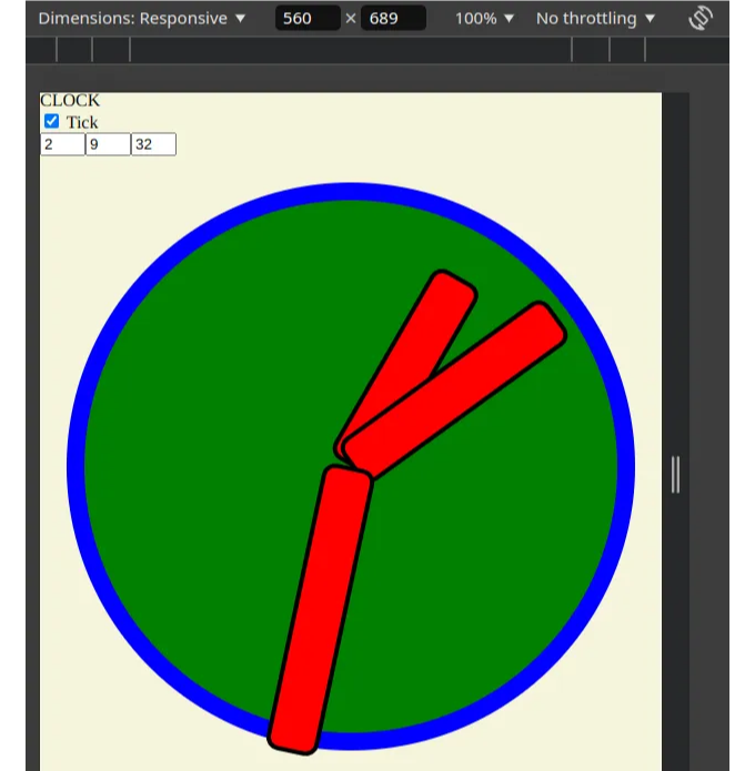
What is of note here is that we made all the integer values of the clock hand positions into two-way computed values. This way, the inputs can both get and set them. What is important to note is that we cannot simply modify the existing date because then the computed getter will not retrigger and the animation will not render properly. The easiest way to notify the reactivity system is to just create a new Date with a modified value. If any value is changed by hand, we disable the ticking so that it isn’t immediately reset. Of course, you can change it back by hand or disable it with the checkbox as well.
또한, 배경을 추가하고 오른쪽과 왼쪽을 잘라내기 위해 overflow hidden을 적용했습니다. 그렇지 않으면 곧 우리의 수정 사항이 컴포넌트를 이동시키고 버그를 일으킬 수 있습니다.
이 단계의 멋진 점은 마우스로 손을 이동할 수 있게 해주는 다음 단계로 자연스럽게 이어진다는 것입니다.
"뭐라고? 그건 정말 어렵지 않아요? 움직이는 컨트롤을 추가하려고요, 단순히 그렇게요?" — 읽는 사람 중에 궁금해할 수 있습니다. 네, 맞아요. 실제로 Vue 3로는 꽤 쉽게 할 수 있어요. 이제 시작해봅시다.
이제 터치 및 마우스 이벤트를 기록해봅시다!
지금 시계에 팁을 추가하고 드래그 & 드롭이 가능하도록 만들고 싶어요! 이를 위해 커서 컴포넌트에 팁 요소를 추가하고 이벤트 리스너를 추가해줍니다.
아래는 McClockHand.vue 파일입니다:
<script setup>
import { computed, ref, onMounted, onBeforeUnmount } from "vue";
const props = defineProps({
    position: Number,
    positionMax: Number,
    length: String
})

const rotation = computed(() =>
    180 + Math.round((360 * props.position) / props.positionMax) + "deg"
);

const dragging = ref(false);

function startDrag() {
    dragging.value = true
}

function endDrag() {
    dragging.value = false;
}

function mouseDrag(event) {
    if (!dragging.value) return;
    console.log("drag", event);
}

function touchDrag(event) {
    mouseDrag(event.changedTouches[0]);
}

onMounted(() => {
    document.addEventListener("mouseup", endDrag);
    document.addEventListener("touchend", endDrag);
    document.addEventListener("mousemove", mouseDrag)
    document.addEventListener("touchmove", touchDrag)
})

onBeforeUnmount(() => {
    document.removeEventListener("mouseup", endDrag);
    document.removeEventListener("touchend", endDrag);
    document.removeEventListener("mousemove", mouseDrag)
    document.removeEventListener("touchmove", touchDrag)
})
</script>

<template>
    <div class="mc-clock-hand">
        <div class="mc-clock-hand-tip" @mousedown="startDrag" @touchstart="startDrag"></div>
    </div>
</template>

<style scoped>
.mc-clock-hand {
    position: absolute;
    width: 10%;
    height: v-bind(length);
    background-color: red;
    top: 50%;
    left: 50%;
    transform-origin: top center;
    transform: translate(-50%, 0%) rotate(v-bind(rotation));
    border-radius: 12px;
    border-width: 4px;
    border-style: solid;
    border-color: black;
    box-sizing: border-box;
    user-drag: none;
    -webkit-user-drag: none;
    user-select: none;
    -moz-user-select: none;
    -webkit-user-select: none;
    -ms-user-select: none;
    touch-action: none;
}

.mc-clock-hand-tip {
    position: absolute;
    width: 140%;
    aspect-ratio: 1;
    background-color: blueviolet;
    bottom: -10%;
    left: -20%;
    border-radius: 50%;
    border-width: 4px;
    border-style: solid;
    border-color: black;
    box-sizing: border-box;
    cursor: pointer;
}

.mc-clock-hand-tip:hover {
    transform: scale(1.1);
}
</style>
현재 결과는 다음과 같습니다.
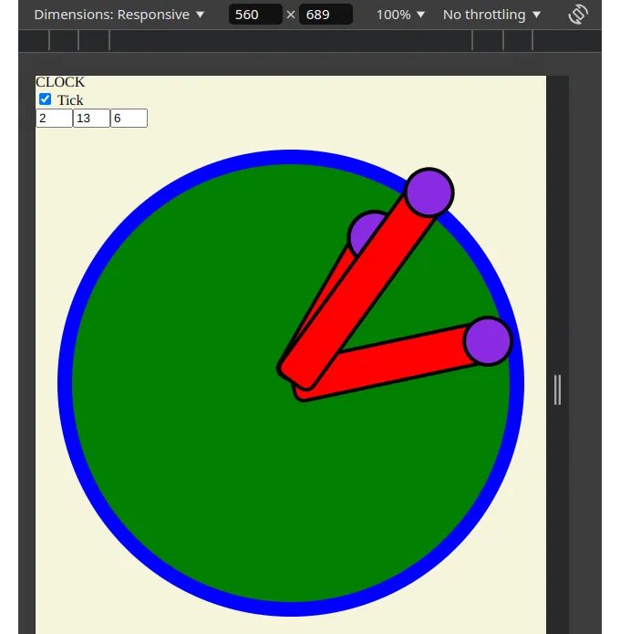
여기서 주목해야 할 중요한 사항들이 있습니다:
- 지금은 드래그 이벤트만 기록하는 중이며 컴포넌트 로직에는 실제로 아무 일도 일어나지 않습니다.
- 팁 자체에는 초기 이벤트만 추가했고 나머지는 문서에 추가했습니다. 이것에는 이유가 있습니다: 문서를 듣지 않으면 경우에 따라 이벤트가 등록되지 않을 수 있습니다. 특히 드래그가 완료되는 최종 이벤트는 문서에 있어야 합니다. 그렇지 않으면 이벤트가 손실될 수 있고 드래그된 요소가 마우스에 "붙어"버릴 수 있습니다. 그러나 이는 우리가 매우 주의해야 한다는 것을 의미합니다. 문서에 손으로 추가된 모든 것은 손으로 제거해야 합니다. 위대한 권한에는 커다른 책임이 따르는 법! 마치 C++에서 수동 메모리 관리와 같은 것입니다.
- 시계 바늘이 user-drag: none; 및 user-select: none; 속성을 추가했음을 주목하세요. 그것들은 중요합니다. 그렇지 않으면 요소를 드래그하면 네이티브 브라우저 드래그 기능이 활성화되어 수동 작업이 깨질 수 있습니다!
이제 마우스 이동 이벤트가 준비되었으니 컴포넌트에 반응성을 추가할 시간입니다!
터치 이벤트에 반응하기
이제 필요한 계산을 해야 합니다. 이번에는 McClockHand.vue 코드에 주석을 추가하여 계산 과정을 단계별로 안내해 드렸어요:
<script setup>
// ...
const emit = defineEmits(["update:position"])
// ...
const mcClockHandRef = ref();
function mouseDrag(event) {
    if (!dragging.value) return;

    // 뷰의 상위에 있는 전체 시계의 바운딩 상자를 가져옵니다
    const rect = mcClockHandRef.value.parentElement.getBoundingClientRect();

    // 시계 페이스 내부에서 마우스의 상대적인 위치를 계산합니다
    const x = event.clientX - rect.x;
    const y = event.clientY - rect.y;

    // 시계의 중심을 기준으로한 마우스의 상대적인 위치를 계산합니다
    const dx = 2 * x - rect.width;
    const dy = 2 * y - rect.height;

    // 중심을 기준으로한 마우스의 각도를 계산합니다
    const angle = 180 - Math.atan2(dx, dy) * 180 / Math.PI;

    // 필요한 스탭 수에 따라 각도를 정규화하고 반올림합니다
    const angelPosition = Math.round((angle * props.positionMax) / 360);

    // 업데이트된 위치를 발행합니다 - flip over를 방지하기 위해 max 대신 0을 리턴
    if (angelPosition === props.positionMax) emit("update:position", 0)
    else emit("update:position", angelPosition)
}
// ...
</script>

<template>
    <div class="mc-clock-hand" ref="mcClockHandRef">
        <div class="mc-clock-hand-tip" @mousedown="startDrag" @touchstart="startDrag"></div>
    </div>
</template>
참고로 emit을 사용하면 이것이 양방향 바인딩이 되어요. 이제 McClock.vue를 수정하여 이를 고려하기만 하면 돼요:
<template>
    <div class="mc-clock">
        <!-- ... -->
        <div class="mc-clock-area" ref="mcClockAreaRef">
            <McClockHand v-model:position="hours" :positionMax="24" length="41%" />
            <McClockHand v-model:position="minutes" :positionMax="60" length="48%" />
            <McClockHand v-model:position="seconds" :positionMax="60" length="55%" />
        </div>
    </div>
</template>
그리고 이제 우리가 원하는대로 모든 것이 정상적으로 작동합니다:

기술 부분을 완료했으니, 한 가지 인정해야 할 점이 있습니다: 우리 시계가 정말 추잡스러워요! 걱정하지 마세요. 이 튜토리얼의 마지막 부분, 즉 이쁘게 만드는 작업이 곧 시작됩니다.
예쁘게 만들기
기술적으로 일을 해냈지만, 물론 클라이언트로서 그러한 추한 시계는 결코 받아들일 수 없을 것입니다. 그래서 우리는 빠른 시간 내에 예쁘게 꾸미는 작업을 해야 합니다. 그리고 실제로 썸네일에 넣은 예쁜 시계를 보러 오신 것 같네요.
걱정하지 마세요! 우리 지금 예쁘게 꾸미겠습니다.
제가 강력히 주장하는 한 가지는 기술적 부분을 먼저 탄탄하게 만든 후에 아름다움을 더하는 것입니다. 그 반대로 하면 기술적 한계에 부딪히면 건축한 것을 파괴할 가능성이 있습니다. 이제 그런 문제가 해결되어서 우리는 원하는 대로 할 수 있습니다.
첫 번째로 이쁜 시계 바늘부터 시작해 보겠습니다.
시계 바늘 그리기
제가 모두 Inkscape에서 만들었어요:

<img src="/assets/img/2024-08-03-MakingafullyinteractiveclockwithVue3_9.png" />
<img src="/assets/img/2024-08-03-MakingafullyinteractiveclockwithVue3_10.png" />
벡터 그래픽은 웹 개발자의 베스트 프렌드입니다. 종종 Inkscape로 몇 가지 기본 벡터 그래픽을 만드는 것이 네이티브 HTML로 꾸미려고 하는 것보다 훨씬 쉽습니다. 저는 그것들을 아주 빨리 만들었어요. 이제 그들은 공용 폴더로 들어갑니다!
이제 이미지를 포함하는 ClockHand의 코드를 변경하기만 하면 됩니다.
<script setup>
// ...
const props = defineProps({
  // ...
  imgSrc: String,
  imgClass: String,
});

</script>

<template>
  <div class="mc-clock-hand" ref="mcClockHandRef">
    <img :src="props.imgSrc" :class="props.imgClass" />
    <div
      :class="{
        'mc-clock-hand-tip': true,
        'mc-clock-hand-tip-shining': dragging,
      }"
      @mousedown="startDrag"
      @touchstart="startDrag"
    ></div>
  </div>
</template>

<style scoped>
.mc-clock-hand {
  position: absolute;
  width: 10%;
  height: v-bind(length);
  top: 50%;
  left: 50%;
  transform-origin: top center;
  transform: translate(-50%, 0%) rotate(v-bind(rotation));
  user-drag: none;
  -webkit-user-drag: none;
  user-select: none;
  -moz-user-select: none;
  -webkit-user-select: none;
  -ms-user-select: none;
  touch-action: none;
}

.mc-clock-hand-tip {
  position: absolute;
  width: 200%;
  aspect-ratio: 1;
  background-color: yellow;
  bottom: -10%;
  left: -50%;
  border-radius: 50%;
  box-sizing: border-box;
  cursor: pointer;
  opacity: 0;
  filter: blur(5vw);
}

.mc-clock-hand-tip-shining,
.mc-clock-hand-tip:hover {
  transform: scale(1.1);
  opacity: 0.4;
}
</style>
이번 단계에서 몇 가지 일이 발생했습니다:
- 외부에서 img의 src와 class를 전달하면 모든 시계 바늘을 동일한 코드로 사용하면서 각각을 개별적으로 구성할 수 있습니다.
- 시계 바늘에서 색상을 제거하고 대신 이미지를 추가했습니다.
- 시계 바늘 팁을 기본적으로 투명하게 만들고 호버시 밝은 노란색으로 흐리게 만들었습니다.
- 드래그할 때 항상 반짝이는 효과를 만드는 두 번째 CSS 속성 "mc-clock-hand-tip-shining"을 추가했습니다. 사용하는 표기법에 주목하세요. Vue를 사용하여 변수 또는 조건에 따라 CSS 클래스를 효율적으로 활성화 및 비활성화하는 방법입니다!
동시에 McClock.vue에서 모든 것을 연결하고 시계 바늘과 일치하도록 색상을 변경하고 있습니다.
<template>
  <div class="mc-clock">
    <div>CLOCK</div>
    <div>
      <label><input v-model="tick" type="checkbox" /> Tick </label>
    </div>
    <input v-model="hours" type="number" min="0" max="24" />
    <input v-model="minutes" type="number" min="0" max="60" />
    <input v-model="seconds" type="number" min="0" max="60" />

    <div class="mc-clock-area" ref="mcClockAreaRef">
      <McClockHand
        v-model:position="hours"
        :positionMax="24"
        length="41%"
        imgSrc="hours.svg"
        imgClass="mc-clock-hand-hours"
      />
      <McClockHand
        v-model:position="minutes"
        :positionMax="60"
        length="48%"
        imgSrc="minutes.svg"
        imgClass="mc-clock-hand-minutes"
      />
      <McClockHand
        v-model:position="seconds"
        :positionMax="60"
        length="55%"
        imgSrc="seconds.svg"
        imgClass="mc-clock-hand-seconds"
      />
    </div>
  </div>
</template>

<style scoped>
.mc-clock {
  overflow: hidden;
  padding-bottom: 48px;
  background-color: beige;
}

.mc-clock-area {
  margin: v-bind(clockMargin);
  position: relative;
  width: calc(100% - v-bind(clockMargin) * 2);
  aspect-ratio: 1;
  background-color: gray;
  border-radius: 50%;
  border-width: 16px;
  border-style: solid;
  border-color: balck;
  box-sizing: border-box;
}
</style>
우리는 주로 src와 클래스만 전달하고 있어요. 하지만 각 시계 바늘에 대한 클래스는 어디 있을까요? main.css에 있습니다. 이들은 사실상 SVG와 결합되어 해상도에 맞게 표시되도록 만들어진 전역 클래스입니다:
@import "./reset.css";

.mc-clock-hand-hours {
  width: 600%;
  transform: translate(-44%, -42%) rotate(180deg);
  pointer-events: none;
}

.mc-clock-hand-minutes {
  width: 750%;
  transform: translate(-45%, -40%) rotate(180deg);
  pointer-events: none;
}

.mc-clock-hand-seconds {
  width: 1300%;
  transform: translate(-47%, -53%) rotate(180deg);
  pointer-events: none;
}
각 클래스는 해당하는 SVG 이미지를 원하는대로 표시하기 위해 크기를 조정하는 것입니다!
지금까지 우리의 결과물을 살펴보겠습니다:
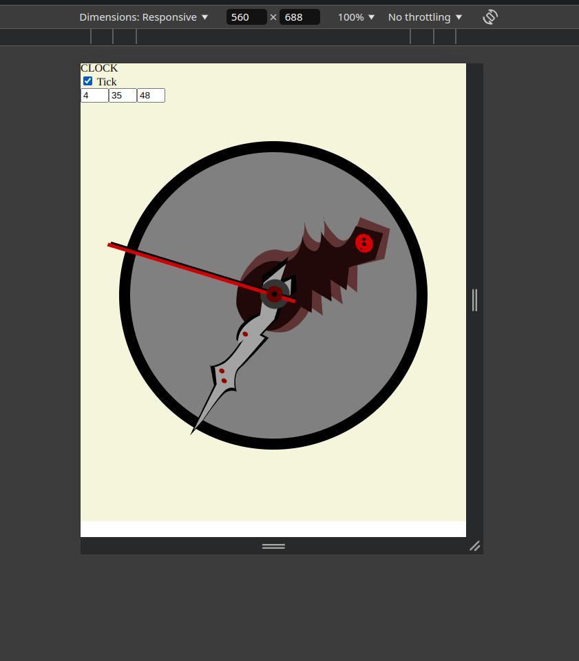
내 의견이지만, 꽤 잘 나온 것 같아요. 스타일이 모두에게 맞지 않을 수도 있지만, 어쨌든 — 이것은 기술적인 튜토리얼이니까요!
이제 마지막 조각을 준비해 봅시다:
시계에 숫자 표시하기
새 숫자 파일을 만들어봅시다. 파일 이름은 McClockDigit.vue가 될 것이고, 이것이 파일 내용입니다:
<script setup>
const props = defineProps({
  digit: Number,
});
</script>

<template>
  <div class="mc-clock-digit-line"></div>
  <div class="mc-clock-digit-container">
    <div class="mc-clock-digit">
      { digit }
    </div>
  </div>
</template>

<style scoped>
.mc-clock-digit-line {
  position: absolute;
  width: 1%;
  height: 20%;
  top: 50%;
  left: 50%;
  transform-origin: bottom center;
  transform: translate(-50%, -100%) rotate(calc(v-bind(digit) * 30deg)) translate(0%, -100%);
  background-color: black;
}

.mc-clock-digit-container {
  position: absolute;
  width: 1%;
  height: 50%;
  top: 50%;
  left: 50%;
  transform-origin: bottom center;
  transform: translate(-50%, -100%) rotate(calc(v-bind(digit) * 30deg));
}

.mc-clock-digit {
  position: absolute;
  font-family: Arial, Helvetica, sans-serif;
  font-size: 7.6vw;
  width: 10vw;
  height: 10vw;
  line-height: 10vw;
  text-align: center;
  background-color: darkgrey;
  border-radius: 50%;
  border-width: 1px;
  border-style: solid;
  transform: translate(-50%, 0%) rotate(calc(v-bind(digit) * -30deg));
}
</style>
주의할 점들:
- 우리는 단일 속성만 전달하고 있습니다. CSS 삽입과 HTML이 모든 것을 처리합니다.
- 이는 정적 컴포넌트입니다. 숫자가 한 번 전달되고 나면 여러 숫자가 렌더링됩니다.
- 컴포넌트가 렌더링되는 방식은 올바른 각도에 숫자를 위치시키기 위해 변형을 적극적으로 사용합니다.
- 숫자의 실제 표시는 그 숫자를 온전히 세우면서 올바르게 위치시키는 것입니다.
McClock.vue에 대해, 숫자를 추가하는 방법은 다음과 같습니다:
<template>
  <div class="mc-clock">
    <div>CLOCK</div>
    <div>
      <label><input v-model="tick" type="checkbox" /> Tick </label>
    </div>
    <input v-model="hours" type="number" min="0" max="24" />
    <input v-model="minutes" type="number" min="0" max="60" />
    <input v-model="seconds" type="number" min="0" max="60" />

    <div class="mc-clock-area" ref="mcClockAreaRef">
      <McClockDigit
        v-for="index in 12"
        :key="index"
        :digit="index"
      ></McClockDigit>

      <McClockHand
        v-model:position="hours"
        :positionMax="12"
        length="41%"
        imgSrc="hours.svg"
        imgClass="mc-clock-hand-hours"
      />
      <McClockHand
        v-model:position="minutes"
        :positionMax="60"
        length="48%"
        imgSrc="minutes.svg"
        imgClass="mc-clock-hand-minutes"
      />
      <McClockHand
        v-model:position="seconds"
        :positionMax="60"
        length="55%"
        imgSrc="seconds.svg"
        imgClass="mc-clock-hand-seconds"
      />
    </div>
  </div>
</template>

<style scoped>
.mc-clock {
  overflow: hidden;
  background-color: beige;
}

.mc-clock-area {
  margin: v-bind(clockMargin);
  position: relative;
  width: calc(100% - v-bind(clockMargin) * 2);
  aspect-ratio: 1;
  background-color: gray;
  border-radius: 50%;
  border-width: 1vw;
  border-style: solid;
  border-color: black;
  box-sizing: border-box;
}
</style>
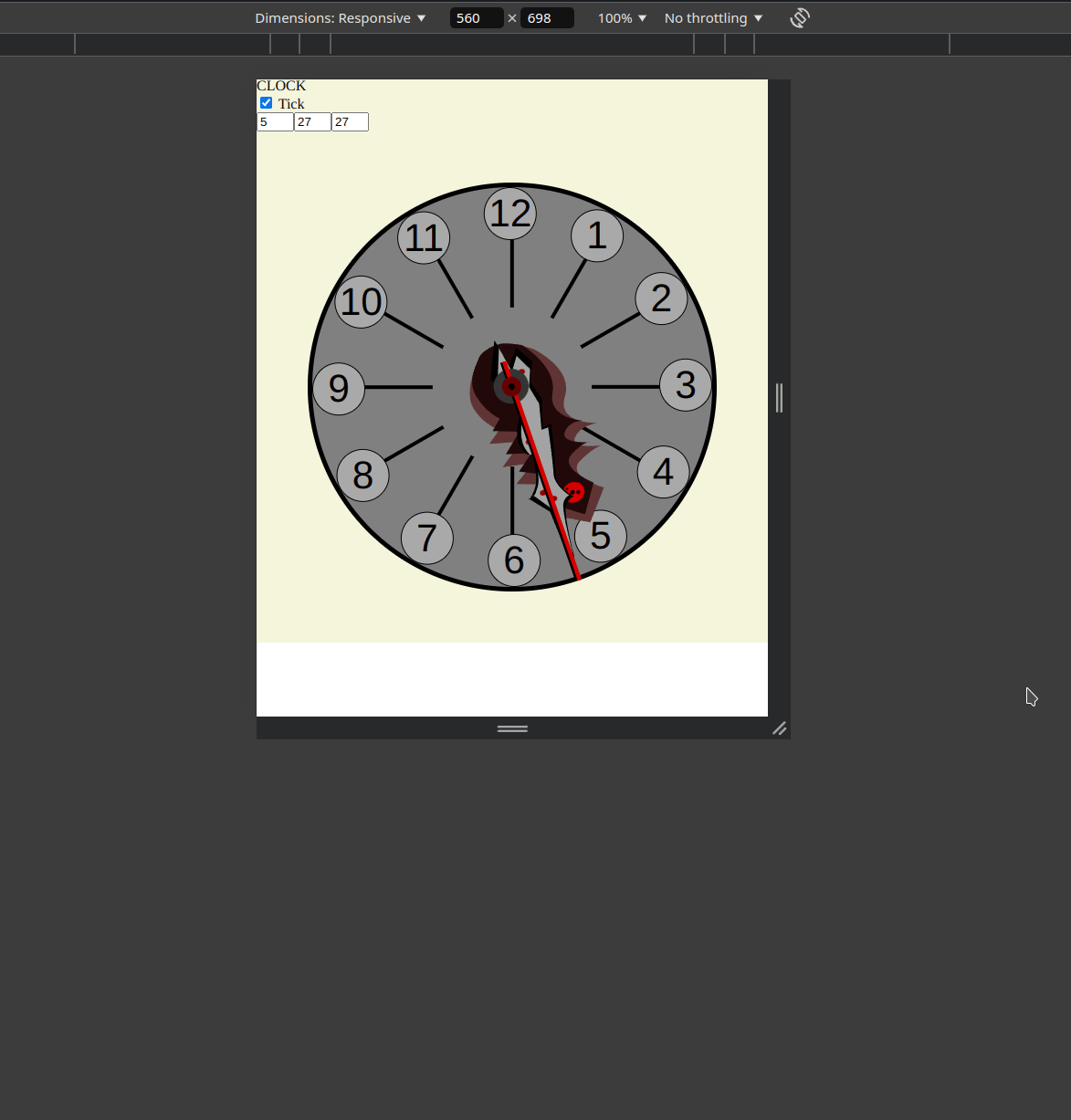
우리는 그저 v-for 루프로 이를 반복하고 있습니다. 몇 가지 더 화장적인 변경사항이 있음에 주목하세요 - 그 중 하나로 시계는 12개의 숫자만 있는데, 시침은 24개 위치가 있습니다. 우리의 구조가 유연하게 구성되어 있어 숫자를 12로 간단히 변경할 수 있고 문제없이 진행됩니다.
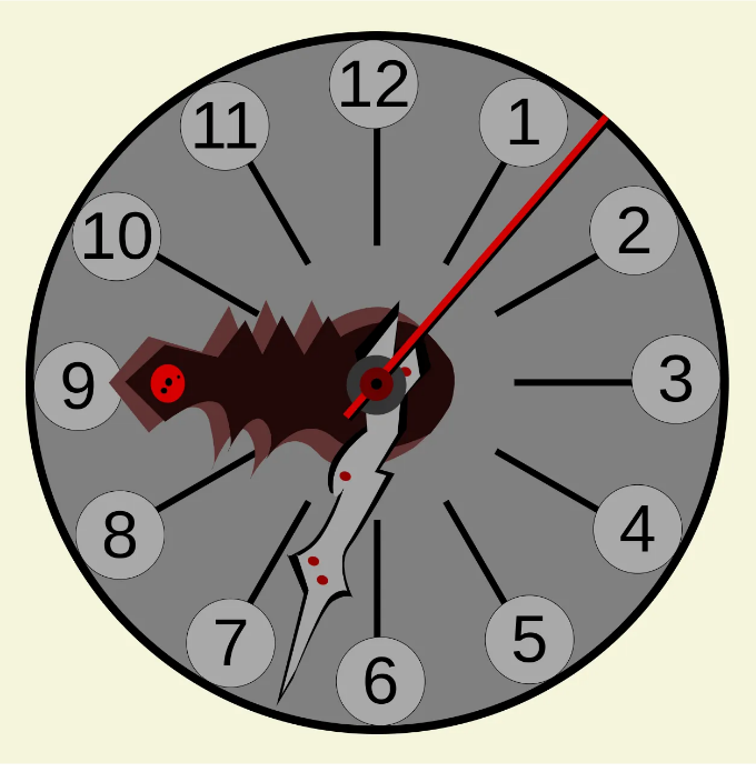
아래는 최종 결과물입니다:
Vue.js에 관한 첫 번째 튜토리얼을 읽어 주셔서 정말 감사합니다! 오늘 무언가를 배우셨길 바랍니다. 피드백과 아이디어에 대해 매우 열려 있으니 망설이지 마세요.
이런 종류의 시계에 대한 튜토리얼을 만들고 싶은 생각은 예전부터 있었고, 만들면서 정말 즐거웠습니다. 시계의 시간이 이동하는 것을 눈치채셨다면 — 그것은 제 컴퓨터의 시간이 움직이는 것이라서, 오늘 밤 늦게 마무리하게 되었습니다. 그런데 정말 기뻐요. 이 프로젝트와 튜토리얼을 한 번에 끝내다니요.
이런 변화를 만들어서 정말 즐거웠어요! 이 프로젝트의 전체 소스 코드는 다음 위치에서 찾을 수 있어요: https://github.com/AdSkipper1337/vue-masterclass-clock 그리고 시계를 확인해보려면 https://adskipper1337.github.io/vue-masterclass-clock/ 에서 확인해보세요! 즐겁게 사용해보세요!
감사합니다, 니콜라이