소개
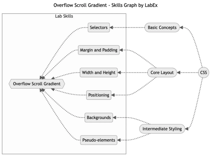
이 기사는 다음과 같은 기술 스킬을 다룹니다:
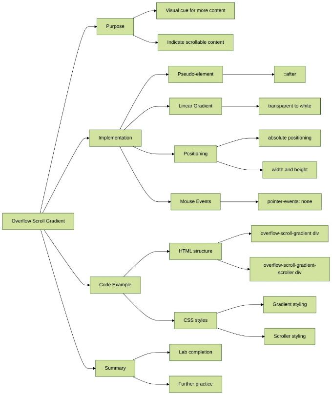
이 랩에서는 CSS를 사용하여 넘치는 요소에 서서히 사라지는 그라디언트를 추가하는 방법을 배우게 됩니다. 이 랩의 목적은 사용자에게 스크롤할 추가 콘텐츠가 있다는 시각적 신호를 만드는 것입니다. ::after 가상 요소와 linear-gradient() 함수를 사용하여 투명에서 흰색으로 사라지는 그라디언트를 만들어 추가 콘텐츠가 더 있다는 것을 나타낼 수 있습니다.
Overflow Scroll Gradient
index.html 및 style.css가 이미 VM에 제공되었습니다.
넘치는 요소에 서서히 사라지는 그라디언트를 추가하고 스크롤할 추가 콘텐츠가 있다는 것을 나타내려면 다음 단계를 따르세요:
- 부모 요소에 position: absolute, width, height를 사용하여 가상 요소의 위치와 크기를 지정하세요.
- pointer-events: none을 사용하여 마우스 이벤트에서 가상 요소를 제외하면 뒤에 있는 텍스트가 여전히 선택 가능하고 상호 작용할 수 있습니다.
다음은 예시 HTML 및 CSS 코드 스니펫입니다:
<div class="overflow-scroll-gradient">
  <div class="overflow-scroll-gradient-scroller">
    Lorem ipsum dolor sit amet consectetur adipisicing elit. <br />
    Iure id exercitationem nulla qui repellat laborum vitae, <br />
    molestias tempora velit natus. Quas, assumenda nisi. <br />
    Quisquam enim qui iure, consequatur velit sit? <br />
    Lorem ipsum dolor sit amet consectetur adipisicing elit.<br />
    Iure id exercitationem nulla qui repellat laborum vitae, <br />
    molestias tempora velit natus. Quas, assumenda nisi. <br />
    Quisquam enim qui iure, consequatur velit sit?
  </div>
</div>
.overflow-scroll-gradient {
  position: relative;
}

.overflow-scroll-gradient::after {
  content: "";
  position: absolute;
  bottom: 0;
  width: 250px;
  height: 25px;
  background: linear-gradient(transparent, white);
  pointer-events: none;
}

.overflow-scroll-gradient-scroller {
  overflow-y: scroll;
  background: white;
  width: 240px;
  height: 200px;
  padding: 15px;
  line-height: 1.2;
}
웹 서비스를 포트 8080에서 실행하려면 오른쪽 하단의 'Go Live'를 클릭해주세요. 그런 다음, 웹 페이지를 미리 보려면 'Web 8080 Tab'를 새로 고칠 수 있습니다.
요약
축하합니다! Overflow Scroll Gradient 랩을 완료했습니다. LabEx에서 더 많은 랩을 연습하여 스킬을 향상시킬 수 있어요.
더 많은 학습을 원하시나요?
- 🌳 최신 CSS 기술 트리 배우기
- 📖 더 많은 CSS 자습서 읽기
- 💬 저희 디스코드에 가입하거나 @WeAreLabEx로 트윗해주세요